Sprezzatura (Making Complexity Appear Simple)
Sorry to interrupt…
If you like what you've read so far, join us on LinkedIn to talk all things digital product development with our team of experts.
Possible on one website?
To make this happen through a website is difficult, because there are so many parties involved. Students, scholars and staff are looking for accommodation, but sometimes departments look on their behalf. The University wants to fill its houses and rooms, as do individual Colleges, but only sometimes, and sporadically. Private landlords also want tenants, and hotels and B&Bs would like to advertise in case anyone needs a short-term stopover…
And the staff need to co-ordinate all this behind the scenes.
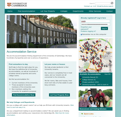
When we first made a website for Cambridge University’s Accommodation Service, our hands were tied. There were strict branding and structure guidelines because the site is a subsection of the overall University website.
When they wanted a redesign – or more accurately a realignment – we found many of those restrictions had loosened. Design was only one part. They wanted to make the information-heavy site clearer and easier to use, as well as adding new features.
The content challenges
- Keeping a depth of information without drowning people in it
- Creating a friendly, helpful but respectable and proper tone (befitting the institution)
- Naming different parties consistently
- Communicating clearly to a multi-cultural audience, some with English as a second language
- Making online registration and other processes as unambiguous as possible to minimise contact with the office
- Selling a service (to several parties) without being sales-like
- Ensuring that user-written content would not dilute the tone and clarity of the site
We tackled much of this through a detailed audit of their content and processes. Once naming and tone decisions had been made, they were ruthlessly applied to content old and new.
We structured the site much more clearly so that each party had a clear route in from the front page – from understanding the purpose of the site, to finding out more, through registration, to eventually having their own logged in homepage, customised to hide any content not directly relevant to them.
Some information was cut, some ordered into ‘Help topics’, and only the most essential and urgent made visible at the top of the hierarchy.
Although there was no sales-sounding pitch, the benefits of the service were shown more clearly to each party, and the staff given the ability to prove their value to the University through analytics and surveys. I wrote style guides to keep new content in line with the new layout and design.
The Accommodation Service project was rewarding because it was a chance to get stuck into real content challenges while having to work closely with the designer and developer.
And it seems to have worked.
Ready to solve your problems?
We'll help meet the challenges facing your growing business. Get in touch and tell us what you need, the team can't wait to hear from you.


