Data visualisation tools supporting academic research into the climate emergency
Services: UX and design | Software engineering
Engineering researchers at the Universities of Bath and Cambridge are examining the carbon impact of heavy industry and petrochemicals. By looking at how we turn materials into products, we can drive sustainable efficiencies by using less and re-using more.
This research happens at an incredible scale. Presenting huge amounts of intricate data to stakeholders who aren’t data scientists (like investors) is a challenge.
Fluent came aboard to conceptualise and create a web-based platform capable of visualising these dense, academic datasets at scale.

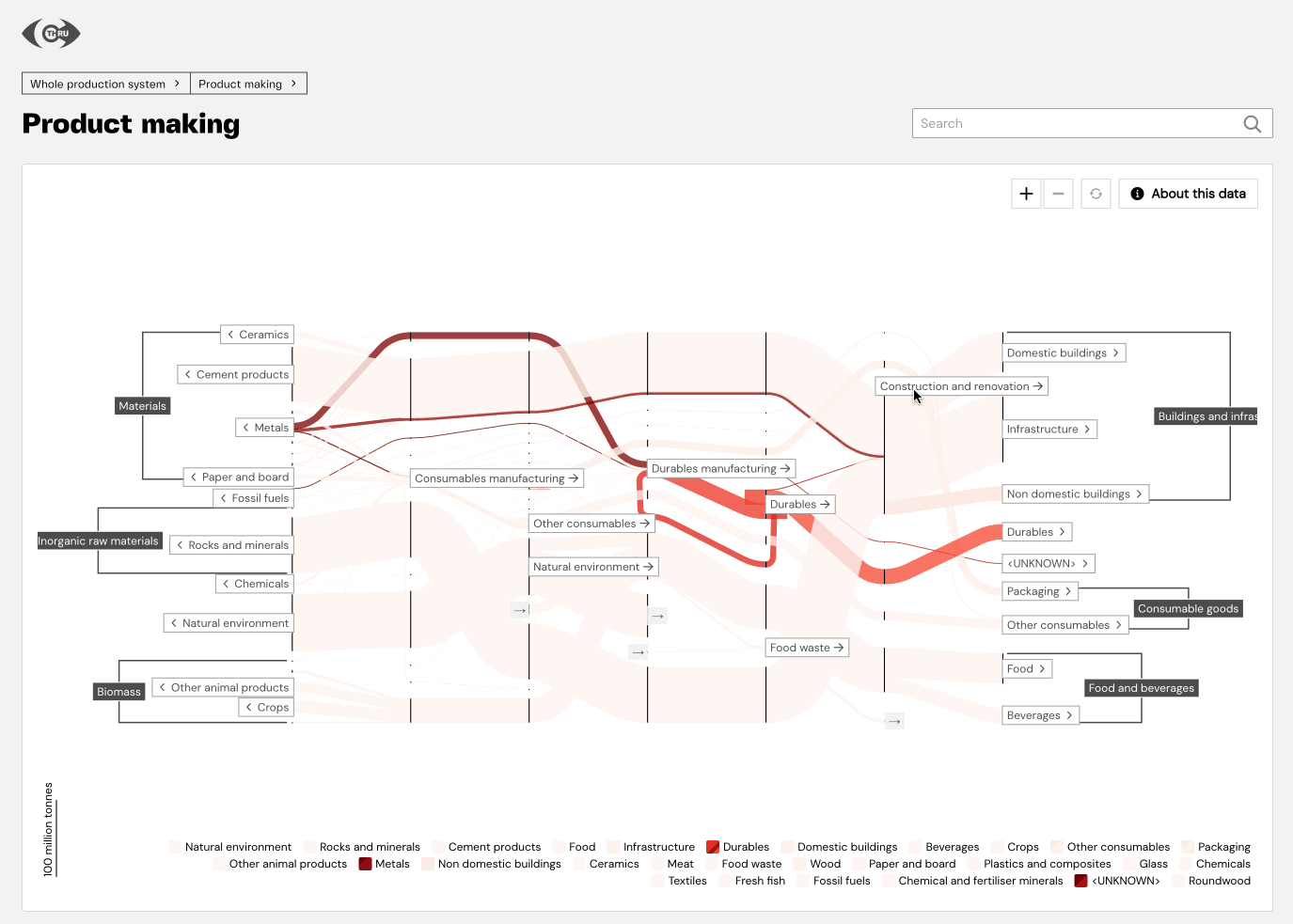
The challenge of epic-scale data visualisation
The C-THRU initiative is a $4m carbon emissions data project based at the University of Cambridge. The UK FIRES collaboration is a similar joint enterprise between the Universities of Bath, Cambridge, Oxford, Nottingham, and Imperial College London.
Both use Sankey diagrams, a data visualisation technique, to examine their respective industries; petrochemicals and large-scale industry.
But a Sankey diagram can only express one viewpoint within an enormous, multifaceted dataset. For these and future projects to express their findings more clearly, researchers needed to combine multiple diagrams into one user interface.
Fluent’s proven track record in sustainability and research digital products made us the ideal fit. Our previous collaborations with the Universities of Oxford and Cambridge gave Bath confidence that we were up to this complex task.
And make no mistake, there were plenty of challenges to overcome. Most projects involve us creating one defined product, but here we’d be making more of a toolkit. This platform had to bear in mind the potential needs of future research, projects which hadn’t even been thought of yet.
The scale and complexity of the data being used meant we’d have to really get to grips with the intended audiences to establish acceptable levels of understanding. Supervisory bodies, investors, researchers working in related fields; each would need to see a different level of detail.
Discovery: Defining what’s possible
Work began with a discovery phase to get a deeper understanding of the project. What were the strengths and weaknesses of existing Sankey diagram tools? In what shape and at what size would our source data be coming to us?
Answering questions like these narrowed down potential technology stacks, giving us a clearer picture of the UX possibilities. We settled on React, and also used this project as an opportunity to implement the new version of NextJS. Visualisation was done in D3, which we’d worked with on past projects.
A lot of the tools we used were more or less unique to this project. RDF, the Resource Description Framework for example, would only tend to come in handy on this specific type of job. Here, it got its time to shine; we pulled information from RDF data to understand how individual diagrams fit together.
The discovery phase produced three big deliverables:
- Figma UX wireframes, showing the journey between Sankey diagrams
- Web-based proof of concept demos for key interactions
- A list of technical architectures capable of delivering the platform
This gave us a solid basis for a series of two-week sprints to build a working interactive Sankey browser. The process connected the high-level possibilities of the discovery phase to what was achievable in practice with the resources available.
We’d be using the entire production dataset for the UK chemicals sector, something relevant to both C-THRU and UK FIRES. So much data meant we had to prioritise what was deliverable. Top priority was a working Sankey browser that let users drill down and roll up to the required level. Further down the chain came things like animations and general performance tweaks.
The finished browser lets researchers access and communicate insights far more efficiently. For their audiences, information gets presented in a more intuitive, engaging way.
A whole new perspective on complex datasets
Now, researchers have the ability to display their work within a UX-friendly web app. Interconnected data visualisation makes exploration more intuitive, a big step forward from relying on Jupyter notebooks.
Visualisation is also reusable and extendable. Users can curate data to either focus on the latest research, or on specific industrial sectors as needed. Some are already using this newfound freedom to hack their own presentation formats together.
We’ve added considerable value and clarity to the process of one diagram flowing into the next. Users can move intuitively up and down a defined data hierarchy. By bridging the gap between conceptual need and technical feasibility, we created something tangible, useful, and scalable.
A touch of Fluent thinking can do the same for your research data project. Talk to us about finding coherence in complexity through better UX design and software engineering.


Got a big idea, want to know how to commercialise it?
Let us help you turn that idea into an actionable strategy.