What Makes a Great Mobile Site?
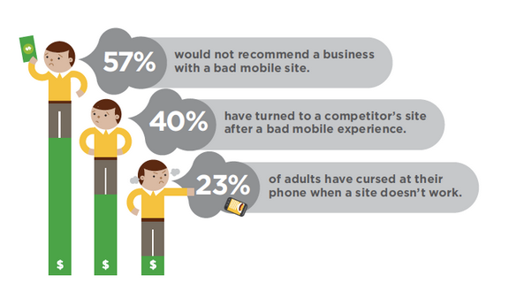
The 2011 survey found that 57% users had a problem with a mobile site in the previous year. Far from being forgiving, these experiences negatively shaped the users’ perception of the brands at fault. A substantial 57% of users said that they would not recommend a business that had a bad mobile site. 46% would not return to the website and 40% had turned to a competitor’s site after a disappointing experience.
Sorry to interrupt…
If you like what you've read so far, join us on LinkedIn to talk all things digital product development with our team of experts.
Mobile is not an extra. The amount of users accessing your site from mobile devices is only going to increase. It’s time to take your mobile strategy seriously.
How to give your users a positive mobile experience
The basic consideration is that your website should work on mobile devices. A responsive design allows you to run a single site that resizes and reorders at different dimension thresholds. This optimises the view on variously sized devices from widescreen monitors to smartphones.
Fluent recently created a responsive site for Portio Research. Our own site is responsive too – if you’re on a monitor try resizing the window to see the optimisation at work.
Beyond actually working, a mobile site should be purely useful – no extras or distractions, simply a way of accomplishing the user’s task. For this a discrete mobile site may be better.
TuckerGardner is a good example. The Cambridge estate agent’s mobile site uses your location to find nearby homes for sale or rent and show you property details, all in a stripped-down and easy to navigate way.
It is useful – and crucially, easy to use. The same principles apply to the site we made for Checkatrade. It is designed to fulfil an obvious primary task – finding a reliable tradesperson – in a way that is straightforward for the user. It is also light, making it fast.
71% stated they expect websites to load as quickly, almost as quickly or faster on their mobile phone compared to the computer they use at home. Compuware survey, 2011.
Get a mobile site that exceeds customer expectations
At Fluent we build websites for mobile, both with responsive design and as separate sites. We know how important it is that they work, that they are useful to your customers, that they are fast and easy to use.
In short, our mobile sites will keep your customers happy with your business and coming back for more.
Understandably, given their increasing importance, we are currently receiving a lot of requests for mobile sites. So if you would like help with your mobile strategy, talk to us quickly before we’re all booked out.
Image and stats from What Users Want From Mobile, a Compuware report surveying 4,014 global mobile web users in 2011.
Ready to solve your problems?
We'll help meet the challenges facing your growing business. Get in touch and tell us what you need, the team can't wait to hear from you.


