Realigning Queens' College web content to meet users’ needs
Queens’ College, Cambridge have a large web estate, managed and updated by a number of content owners with different areas of focus. Over time, their content and navigational structure had drifted - creating a number of visible stress points for site visitors and content owners.


For example:
• Visitors had difficulty locating information that is known to be on the website
• Information on similar topics appeared in different places with different messages
• Information was organised by the college’s structure rather than a user’s perspective
• Labels were misleading or downright mysterious
The result was a website that, although used and respected, didn’t give confidence that all information was accessible in a reliable manner. And, without a coherent structure, it was hard to add new topics or give certainty about the accuracy and timeliness of the content.
To help tackle these issues, Queens' invited Fluent to conduct some independent research and make recommendations for bringing their errant content back in line.
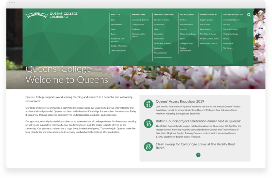
First up, we ran an inventory of existing site content in Google Analytics to help see how the site was being used, and by whom. Based on the results, we identified 8 audience groups and 50 content topics to use in a card-sorting exercise with key stakeholders, ranging from senior academics to students.
Our focus groups began by asking stakeholders to list the audience groups in order of priority. Were prospective students more important than current students? Or staff more important than visitors?
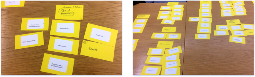
We then asked them to sort content topics cards into groupings that ‘made sense’ - ideally with their priority audience top of mind. While some groups achieved a more ‘successful’ structure in this regard than others, the debate around it gave us plenty of clues about what was - and wasn't - working.
Our research produced two key deliverables for Queens; a report and a new site map, aligned to users' needs. The report shares themes and insights from the focus groups and provides the rationale behind the proposed changes to the site structure. To assist with its ongoing governance, it also includes a mission statement and some guiding principles for content owners.
We’re delighted that Queens’ have since implemented nearly all the changes we recommended, including the addition of a college ethos, which the groups told us was missing.
When the analytics are rerun later this year we expect to see an increase in traffic to the prospective students and visitor pages, two groups we identified as under-served by the old site structure. Watch this space.


Let's work together
We’d love to hear from you. Make our day.
All ideas welcome. We’ll soon let you know if we’re able to help.