All the world’s a client (but not everyone’s a candidate)
Technical Moves are a recruitment company based in Shelford and Royston who specialise in placing people in roles in the built environment sector (that’s engineers, surveyors and architects to you and me...).
In other words, they’re niche, personal and professional, with a sector knowledge that’s second-to-none.
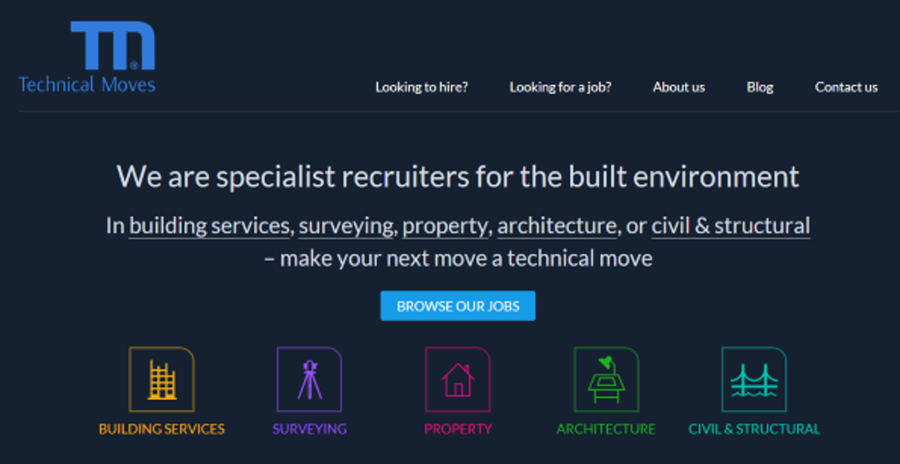
But their old website implied a somewhat more ‘generic’ service offering. With restrictive search filters, bland corporate imagery and confusing references to ‘clients’ and ‘candidates’ - it wasn’t a true reflection of them - or their service offering.

So, our challenge was to design and build new website that put TM’s service and its people right at the heart.
Understand my needs…
We started - as always - by mapping out the user journey.
As it turns out, people who visit recruitment sites don’t think of themselves as clients or candidates. But they do come with basic expectations that must be met if they’re going to stick around.
Most of TM’s customers are either looking to hire or looking for a job. A function so important we acknowledged it in the top level navigation.
To add extra scope for serendipitous discovery and general perusing, we added a 'Browse' button to the home page, which aggregated all job posts, with most recent additions at the top of the page.
And for those job seekers who wanted to search with a bit more focus, we categorised the jobs into TM’s main areas of specialism, which we signposted with bold icons on the homepage.

...but don't fence me in
Because different hiring managers often give similar roles very different job titles, it was important not to narrow down job seekers’ search options too early on. (A search function so specific it hardly returns anything, is no good for business). We solved this by listing suggestions for similar roles once someone had clicked on a job description. (Think Amazon product recommendations).

Thanks to a fully responsive design, job hunters can search away on their personal smartphones while pretending to be working.* And if they don’t succeed in finding themselves a job, they can easily share a job description with with a friend or colleague on social media. Over 20% of traffic to TM’s website is generated by activity on Twitter and LinkedIn so this was an important new addition for them.
Every element on a website has to earn its place by serving its overall objectives. That’s why we removed generic stock images of unknown business types in favour of real TM people who really know their stuff.
You’ll find their photos and contact details alongside every job posting. After all, they’re a people business at heart and now have a website that truly reflects that.
* T.M research-based fact, not our own experience - honest.
Ready to solve your problems?
We'll help meet the challenges facing your growing business. Get in touch and tell us what you need, the team can't wait to hear from you.
Contact us
![2295X1200 Social Media [ All ] 01](https://fluent-umbraco-hwduaufvc9h8gbad.uksouth-01.azurewebsites.net/media/scujluzj/2295x1200-social-media-all-01.jpg?width=3840&height=2160&quality=70&format=Webp)

