The Curse of the Magic Button
The words I have come to dread the most when talking to customers are: ‘can we just have a button that ...’
It doesn't matter whether it's a very useful function that would be trivial to implement, or a fantastically complex process that would involve bending time and space to achieve. The customer wants a magic button. Just a magic button.
My kids want justone more story before bedtime, my wife says she'll just be a minute when diving into a shop, a salesman tells me a piece of plastic is just £16, I tell myself I'll just have a couple of beers. Quite frankly I just don't believe in ‘just’ anymore.
It's a word we use to try and minimise the effect of something. To make it seem not a big deal. To show that we intend for things to be smaller than they really are, and if we use this word at the right place maybe we will all share in this illusion of shrinking effort, time or cost. Using the word just shows we are aware that something is bigger or more significant than we would like it to be, and we are subconsciously trying to excuse it.
The problem with buttons
Back to buttons. The reason we all want a button is that it is simple. We push it and it does want we want. That's fantastic when the button says ‘Print’ but slightly harder to implement when the button says ‘World Peace’ or ‘Win European Cup’. Such buttons would be fantastically valuable, because they would offer great reward for little effort. However, there is a reason that magic buttons do not exist – if it's not possible to do the underlying task there is no point in fussing about how handy the control mechanism may be.
Second problem – too many simple things can make it complicated. How many buttons can you have? Often a button is imagined only from within a certain scenario (you are here – with problems A and B – and know that C should be this – and need to see information D and E) and then a single action makes perfect sense. However change the situation or assumptions slightly, and the button is unnecessary – at best a waste of screen space and at worse a dangerous distraction into how the program should not be used.
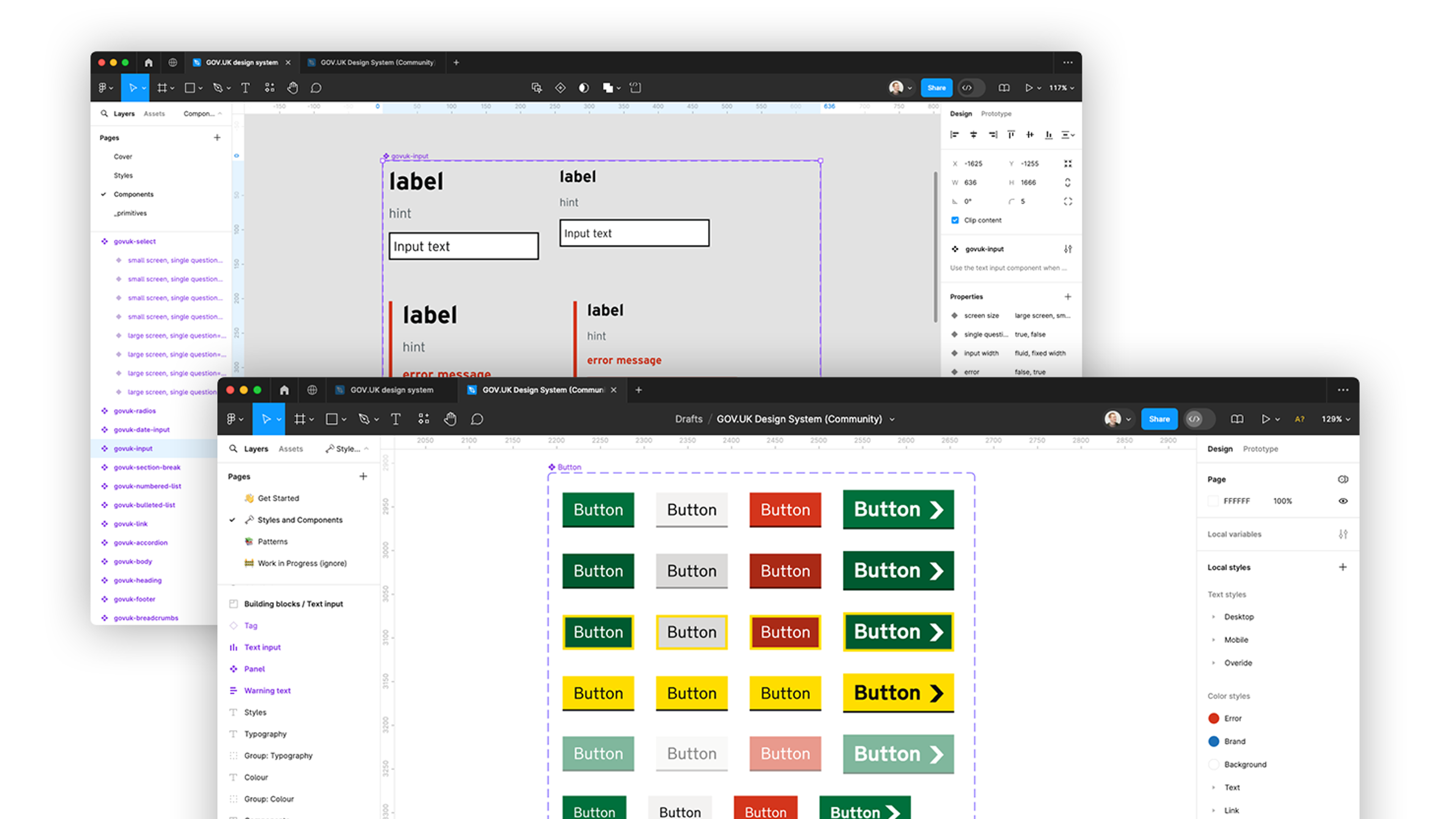
Think about how many buttons there used to be in Word. They are grouped together into toolbars, and then whole toolbars can be customised and managed in palettes. Eventually ribbons were invented to try and figure out how to herd together and control these magic buttons. There was even a whole programming environment that made it ridiculously easy to create magic buttons – Visual Basic 6 – and as a result a whole generation of unusable applications. The moral? Too many simple things can make the end result complicated. Whenever we optimise for one thing we make tradeoffs against other functions or uses.
Ours to question why
If customers ask me for a button, I will ask why they want that button. That's not to be rude or question their judgement, it's to discover the motivation for requesting the functionality that they want to represent as a button. What is the current system not doing for them? What has changed? Under what circumstances do they need the results that will be obtained by this button? Are there other similar scenarios that should be considered? Is this the simplest and most efficient way of achieving this goal?
In a nutshell that's what we do – try and unpack what will work best for our customers’ needs, by understanding the situation and selecting the most appropriate technology to help.
Please don't try and reduce this to 'just a button'.
Ready to solve your problems?
We'll help meet the challenges facing your growing business. Get in touch and tell us what you need, the team can't wait to hear from you.
Contact us
![2295X1200 Social Media [ All ] 01](https://fluent-umbraco-hwduaufvc9h8gbad.uksouth-01.azurewebsites.net/media/scujluzj/2295x1200-social-media-all-01.jpg?width=3840&height=2160&quality=70&format=Webp)

