University of Cambridge Accommodation Service web application
Redesigning the Accommodation Service web app
The University's Accommodation Service finds University members from all over the world homes and rooms in Cambridge via a network of local landlords, individual colleges and central University accommodation. It is also a hub for information about the city and runs a property management service for private landlords and the University.
We go way back.
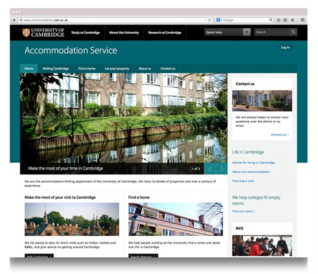
We built the Accommodation Service’s web application 10 years ago, and it has become mission-critical. It provides user accounts for hundreds of landlords and thousands of seekers each year. Landlords use it to manage their properties, and seekers’ accounts let them filter through properties and save their custom searches. The Service itself relies on the application to manage their workflow communications, support landlords, and generate a large array of University reports.
As the Service’s needs have changed, we have kept the website up to date – adding features, resolving issues and occasionally redesigning everything to match the University’s latest style guides.
How times have changed
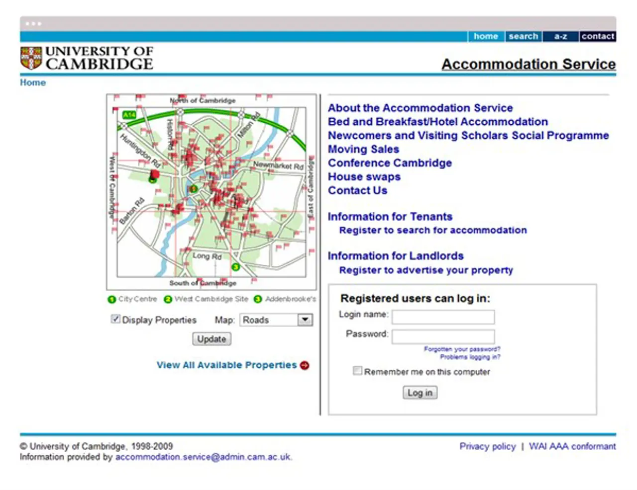
In 2013, the University prompted a wholescale redesign of all their websites by launching Project Light. Previously, we have worked within University-supplied style guides which gave us straightforward headers, footers and colour palettes. Project Light was designed to bring the University’s hundreds of semi-independent websites into line. Its guidelines were much more complete for the modern web. And, they called for responsive design.
Turning an existing website into a responsive website – one that works on different-sized screens like smartphones and tablets – always takes more than a lick of paint. It’s more of a rebuild than a rearrange.
A website with 10 years of service, rebuilt,…
Project Light provided page templates to make theming easier. We found that these worked great for straightforward content: words, images, and the shape of a page. However, most of the application's functional features were not covered: filtered search, interactive maps, user accounts, property management and the rest. Templates and style guides work well for consistency, but they were lacking in areas of UI design that we could apply to the more app-like aspects of an interactive website.
We rebuilt each of the interactive features by reading between the lines of the new guidelines.
Maps, for example, took particular attention. A big, beautiful, interactive map worked a treat on a big monitor. But, if you tried the same map on a smartphone, it would take over the entire screen and you would find yourself scrolling all around Britain instead of down the page. Combine a map, a list of entries and some seach controls on to one mobile page - and you have to start innovating.
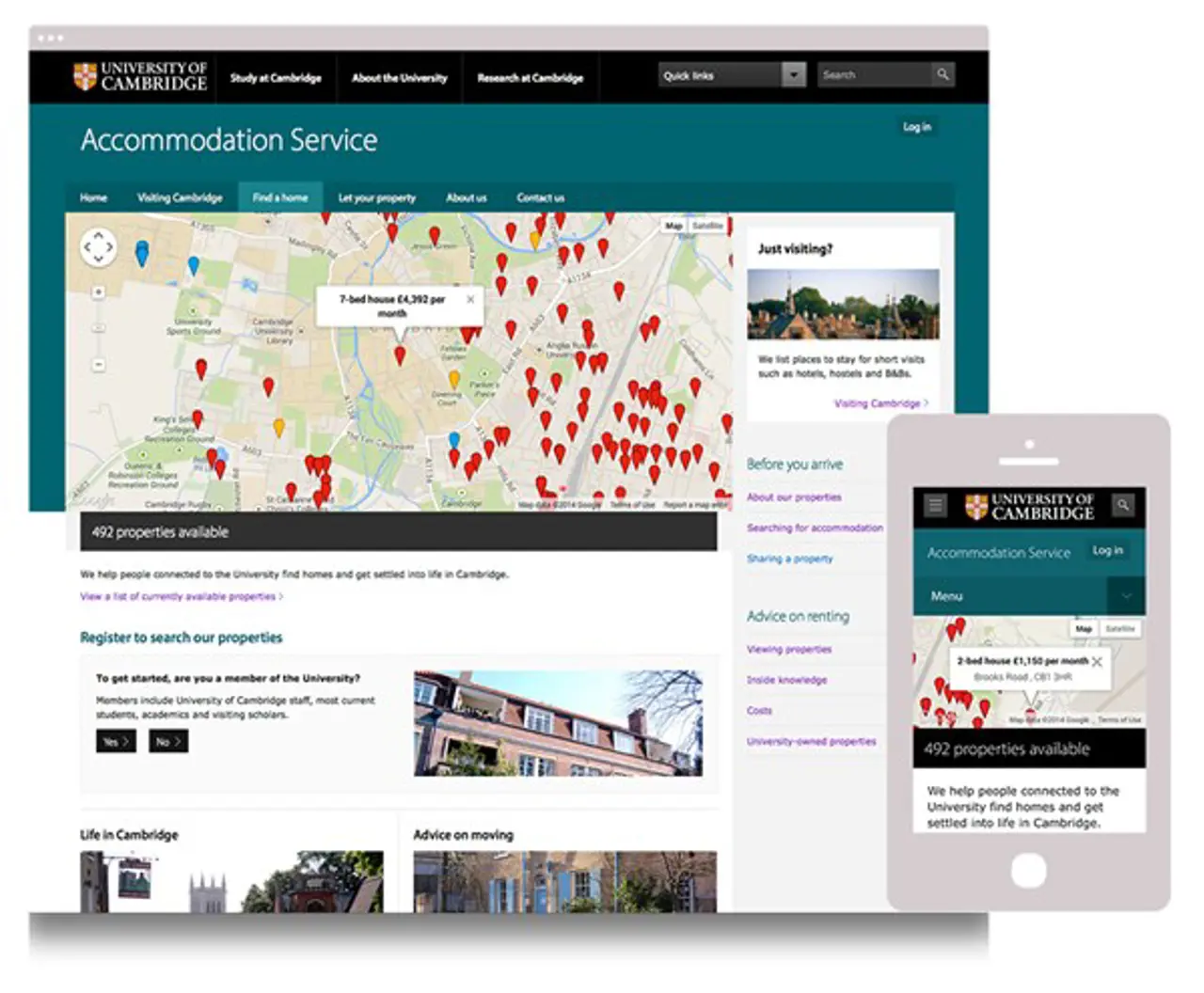
…realigned,…
As we worked our way through every feature, we had the opportunity to bring the whole application in-line with the Service's evolving needs.
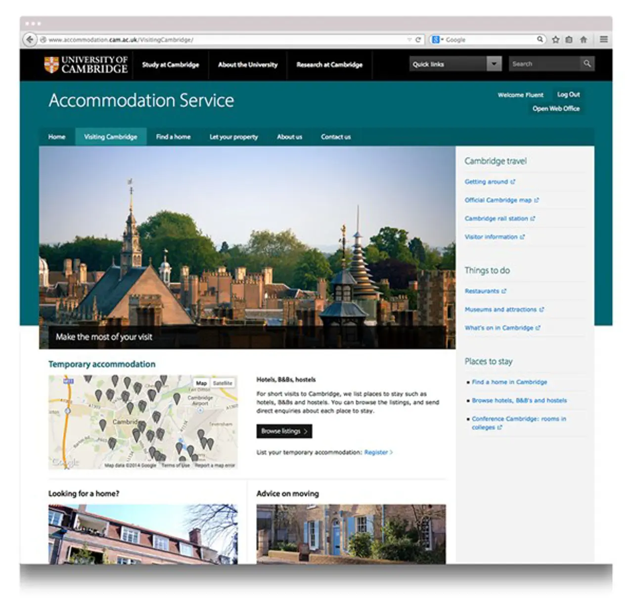
For example, the application had been designed to find places to live. But many people just need a place to stay for a short visit. So, we added a brand new section to the website: Visiting Cambridge. From the front end, visitors can now browse local accommodation, and find out more about Cambridge itself. In the back-end, we created a whole new category of user. Now, managers of short-term accommodation – such as B&Bs and hotels, can sign in and list their lodgings.
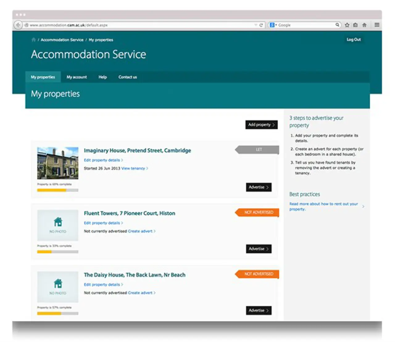
We also radically re-designed the way landlords login and use the application. For one thing, Landlords are now required to provide an Energy Performance Certificate for their properties. We added an upload feature to let them supply a copy of their EPC directly. This saves the Service' staff from chasing individual landlords, and asking for emailed (or even posted) copies. Also, the overall landlord workflow has been improved. By grouping tasks and property details together using a modern tabbed layout, landlords have a clearer view of their properties. They can now see at a glance which actions (e.g. advertising a property) are imminent.
…and ready for the future.
What we’ve ended up with is a sleek web app which has been working for 10 years. It is the tool that the Accommodation Service uses constantly to manage their interactions with landlords and seekers.
The application sits comfortably with the University of Cambridge’s huge collection of websites, but has been built for a very specific purpose: to let the Accommodation Service find lodgings for thousands of people, and help them get settled into life in Cambridge.
Ready to solve your problems?
We'll help meet the challenges facing your growing business. Get in touch and tell us what you need, the team can't wait to hear from you.
Contact us![2295X1200 Social Media [ All ] 01](https://fluent-umbraco-hwduaufvc9h8gbad.uksouth-01.azurewebsites.net/media/scujluzj/2295x1200-social-media-all-01.jpg?width=3840&height=2160&quality=70&format=Webp)
