A grand design for Rees and Associates
When lettings experts, Rees and Associates approached us to redesign their website, we knew just the man for the job.
"Friendly, local, and easy on the eye," they said.
"That’s our Piers," we said.
"No. That’s our brief for the new website," they said.
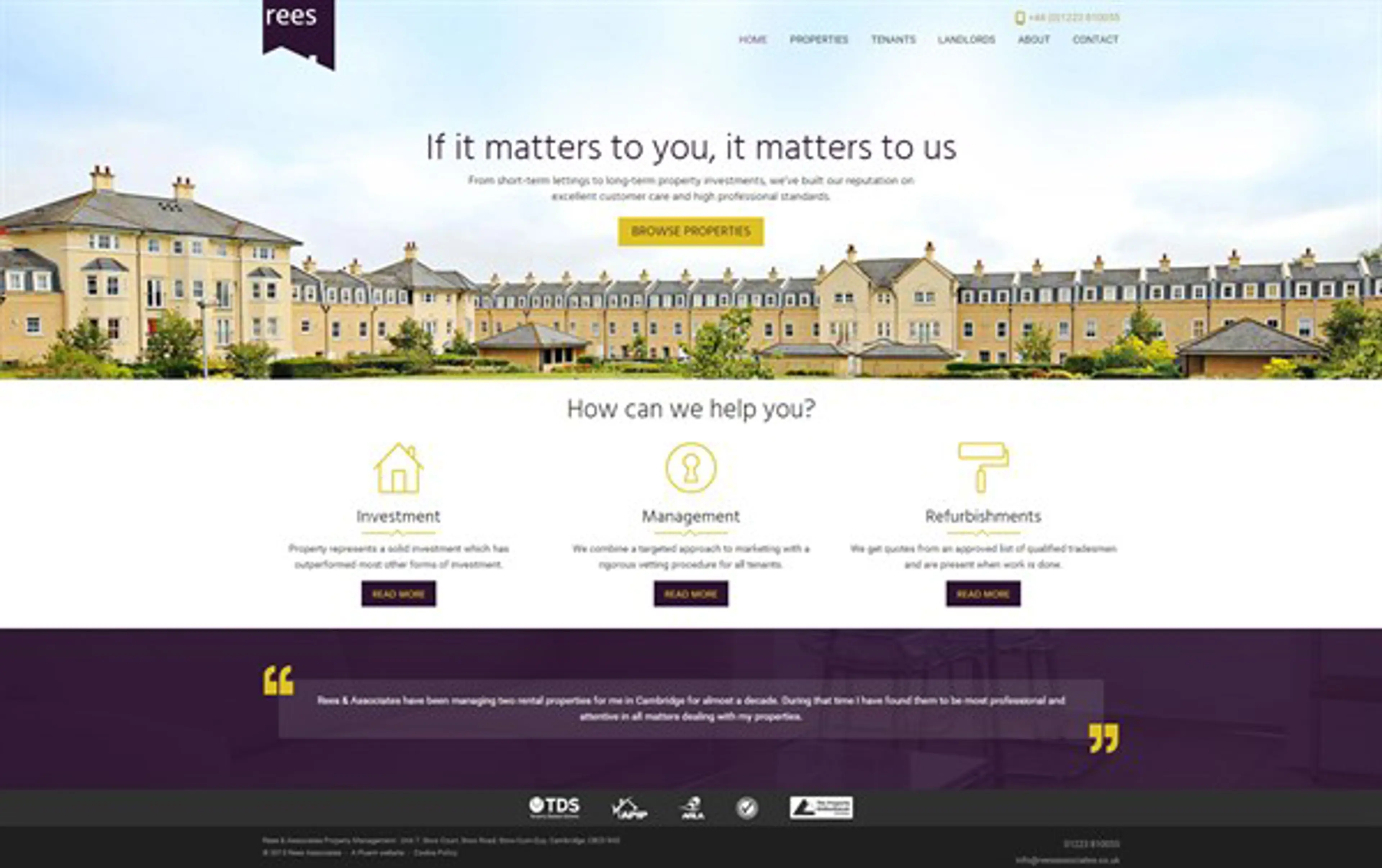
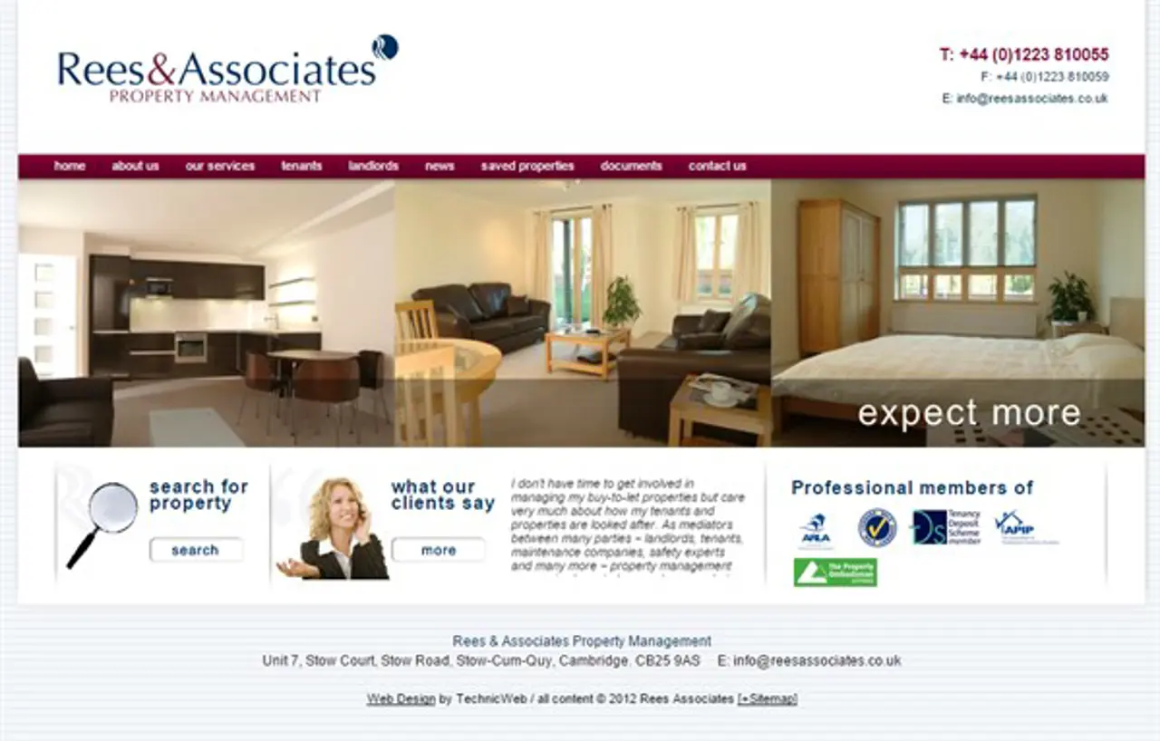
Fortunately Piers was well matched to the task in hand, transforming their cluttered, old bungalow of a site into a sleek modern apartment with plenty of curb appeal. High quality pictures and icons replaced superfluous words, allowing the properties to do all the talking.
Bungalow:
Des Res:

The colour purple
When MD, Bill Rees’ brought in his purple jumper in as a colour reference for the site, it was a first for us. But we successfully matched it, rechristening the colour Bill’s Jumper (Eat your heart out Farrow and Ball.)
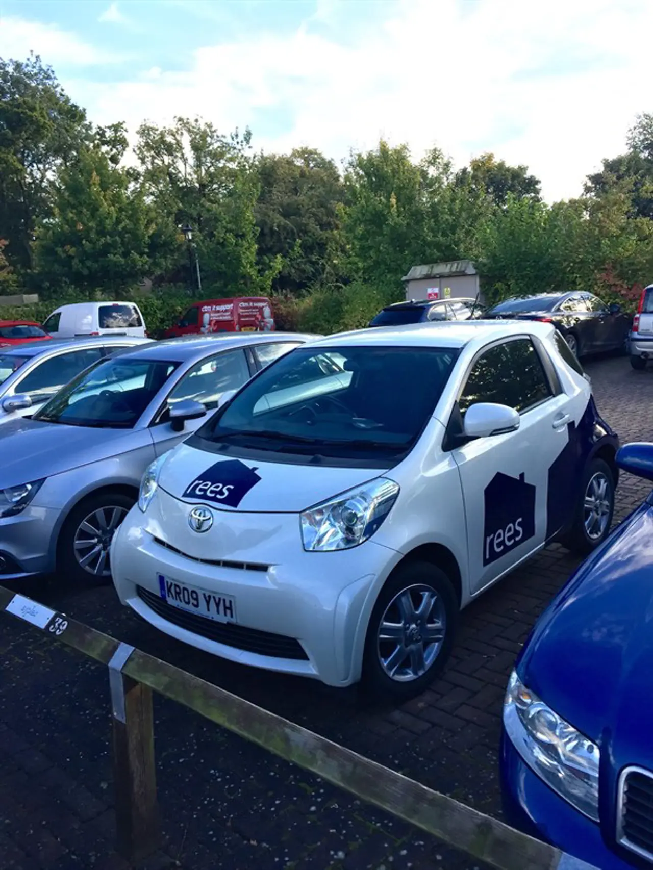
We also used Bill’s Jumper for the new company logo, which proved such a hit, it now graces all their marketing materials, including one of their cars.
Now for the science bit
Underpinning the pretty facade is some serious systems integration. We took their existing property management software, CFPwinMan and built a real time syncronisation tool which connects to the website CMS, Umbraco. The result is a CMS that’s as slick and intuitive to use as the front end.
Ready to solve your problems?
We'll help meet the challenges facing your growing business. Get in touch and tell us what you need, the team can't wait to hear from you.
Contact us
![2295X1200 Social Media [ All ] 01](https://fluent-umbraco-hwduaufvc9h8gbad.uksouth-01.azurewebsites.net/media/scujluzj/2295x1200-social-media-all-01.jpg?width=3840&height=2160&quality=70&format=Webp)
