Sparkol boost sales with smart design
Back in February last year, we wrote about a nifty piece of software called Videoscribe, which is made by a company called Sparkol.
Videoscribe is an online tool, that allows anyone to create their own whiteboard-style animation, without any design or technical know-how.
We worked alongside Sparkol’s talented in house design team to create a new website for Videoscribe. The aim was to showcase its features and benefits as well as generate sales.
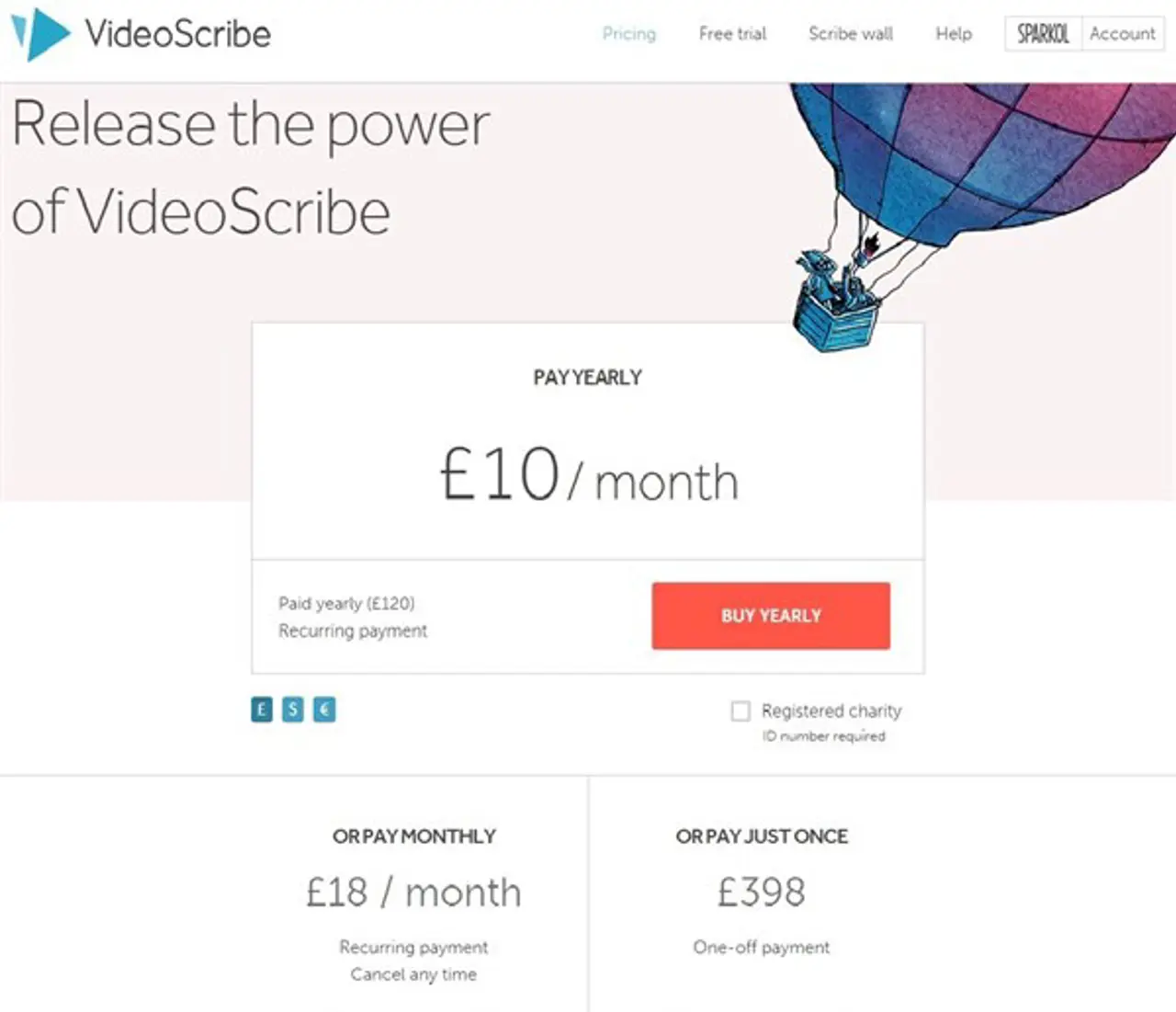
Sparkol brought us in to help them improve the performance of their pricing page. They were keen to test whether changes to the design would have a positive impact on sales conversion rates.
We created different layouts around the same messages, which Sparkol then used to conduct A/B (split group) tests.
The A/B tests showed that there was a measurable difference in the way the test groups responded to the designs - with one generating 11% more conversions and an average increase in spend of £2.50 per visitor.
And because the experiments told us which elements were working, we were able to make further suggestions and enhancements. It’s all part of an ongoing process - there’s no such thing as a ‘final’ design.
So how did the results inform our latest work? Well, the ‘best’ deal has been made more attractive by giving it more space on the page and a much bigger font. Even the position of the image next to it draws the eye in.

It’s worth investing the time upfront to test how even simple, design changes can help enhance your message.
As Sparkol already know, smart design sells.
Ready to solve your problems?
We'll help meet the challenges facing your growing business. Get in touch and tell us what you need, the team can't wait to hear from you.
Contact us
![2295X1200 Social Media [ All ] 01](https://fluent-umbraco-hwduaufvc9h8gbad.uksouth-01.azurewebsites.net/media/scujluzj/2295x1200-social-media-all-01.jpg?width=3840&height=2160&quality=70&format=Webp)

