Without a design system, your digital product development is missing out

Design systems; you've probably heard about them and come away with the impression that they'll make your UI look nicer and speed up development. But they also mean building something on the side of your product that isn't your product.
Is that a worthwhile investment? Let’s explore what design systems add to the design process and how we implement them for better, faster, more cost-effective digital products.
What is a design system?
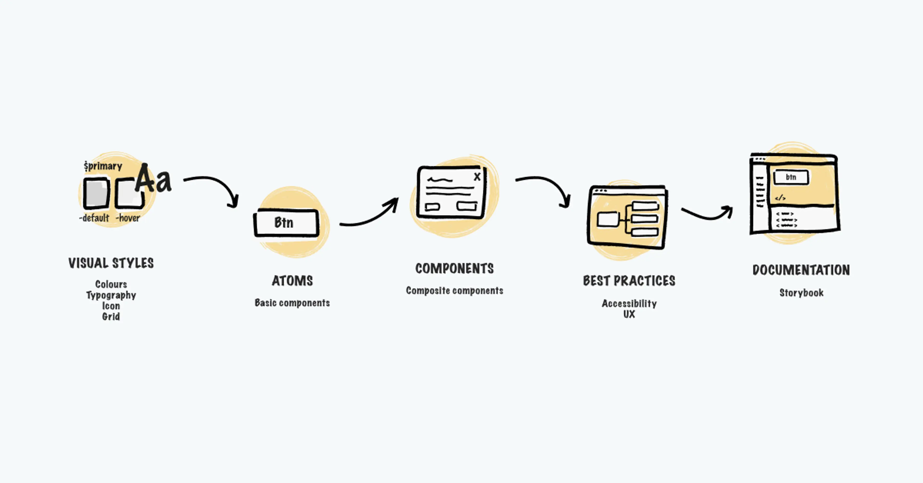
A design system is a living palette of digital visual elements and design standards which are used in the creation of your product. It encompasses your brand’s style guide, alongside a component and pattern library.
By sticking with a design system, designers get a clear steer so they can create without having to reinvent the wheel every time a new challenge pops up. We’ve watched them come to prominence in the last five years or so as a response to four major obstacles to proper development:
- Lack of physical constraint: When it’s possible to develop anything you can imagine, how do you avoid getting distracted by something shiny?
- Larger teams: Different teams working on different sites have trouble creating consistent experiences
- Cross-platform operations: How can you be sure something designed as a web application will still look sexy as a native mobile app?
- Continuous iteration: Few digital products remain static nowadays, they evolve over time. This creates more issues with consistency
…That still sounds like a component library though?
Nope. Design systems are more than the sum of their pattern libraries or development frameworks. They’re what connects those libraries to your brand identity and business goals. If you rely solely on open source component libraries, you risk arranging those components into a fragmented pattern.
Nor are they a replacement for UX and design expertise, they’re not modular Lego sets. They will, however, allow skilled designers to work at peak efficiency and help development scale.
Think of a design system as a visual language. You can employ all the talent money can buy, but they’re going to struggle if they can’t communicate. With protocols in place, communication and collaboration get easier.

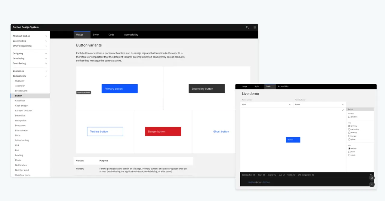
IBM’s Carbon design system features usage, style, and code guidelines, as well as accessibility considerations and a code sandbox for designers and developers to visualise components.
So, why bother with a design system?
Once you set yourself up with a well-crafted design system, the positive results quickly start making themselves known. Immediately, you can start experimenting and trying out new ideas at a dramatically reduced cost. You’ve got those established patterns, so it’s quick and easy to assemble a lean proof of concept without committing major development costs.
That’s huge, it fosters a mindset which rewards people for pitching new concepts. If it’s slow and awkward to try things out, folk simply won’t bother. A design system overcomes that while also ensuring that designers don’t go off the rails with their proposed changes.
Narrowing down to a strict palette of design features keeps things consistent. Design systems encourage experimentation without giving room for any Frankenstein’s monsters to arise. As long as everyone plays by the rules, even the most ambitious new ideas will still look and feel like your brand.
Best of all, these benefits scale. The time and expense of establishing a design system pays for itself many times over once you start adding more people working on more elements. It’s not uncommon for fast-growing companies to find themselves coordinating hundreds of people all over the world across dozens of teams.
Of course, a design system will need long-term ownership and maintenance. They’re living, organic things which ideally evolve alongside your business’ needs. Someone within your company needs a stake in the project’s success in order to commit those resources. Pitching the idea isn’t always easy.
The business case for design systems
It may well be that you’re fully sold on all this, but your boss isn’t. It’s a big job to build and maintain these systems, so internal objections are pretty common:
- Speed: the need to get something shipped takes priority
- Cost: funds are required elsewhere
- Understanding: colleagues don’t see why a system is needed
These objections show up at every stage of your business’ lifecycle. New companies perhaps have the most enviable position of starting with a clean slate, the best time to define design principles. However, the urge to rush a project to market means design systems get forgotten about.
Meanwhile, established businesses have time and resource on their side, you’d think that’s a great time to set up a system. But by the time these businesses build momentum, they’ve already accrued so much design debt that pulling all their assets together into one consistent system is a monstrous task.
Depending on how your business approves projects like this, it can be a big ask. Constructing a solid business case for a design system is sure to help. Think about the pain points you’re currently seeing:
- Are competitors beating you to market? Design systems help develop new products and services faster
- Individual projects coming in late and over budget? Resources spent establishing a design system brings those isolated costs down
- Do users report a scattered, inconsistent experience? Design systems shore up that recognition and trust in your brand
- Is innovation stifled, or even discouraged? A design system sets people free to trial new ideas more easily
- Find yourself constantly playing whack-a-mole with UI bugs? Design systems cut down on bloated code and allow you to replicate great practice
Come on, surely we can use something off the shelf?
In some situations, a design system might not be the right hill to die on. If you’re building something that’s purely for internal use, or if time and budget really are seriously against you, maybe save the idea for another day.
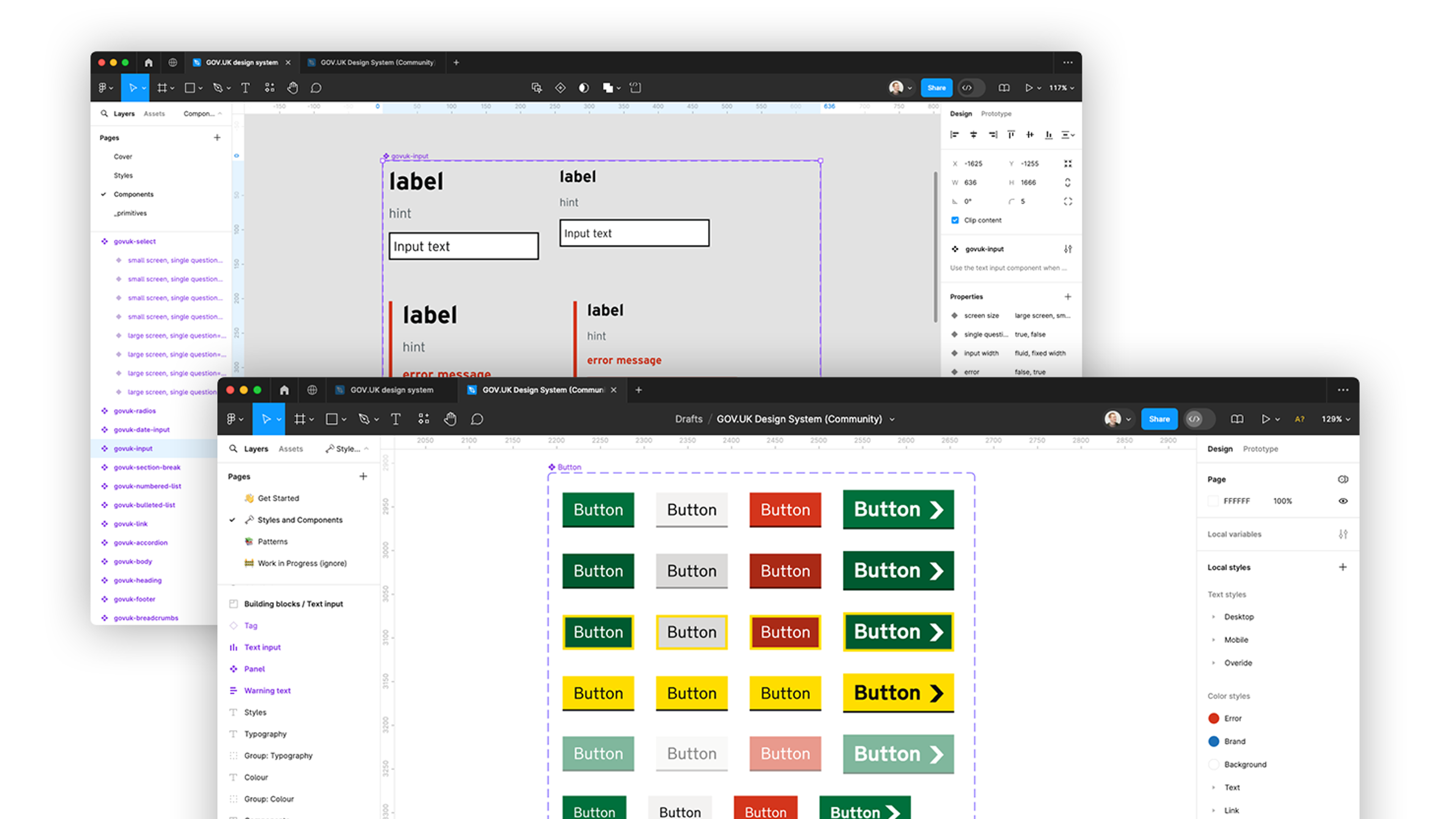
Using Bootstrap, Material UI et al could indeed shore up some problems with consistency. Recolour them to match your brand, implement your style guide and pattern library wherever possible, job’s a good’un.
However (and it’s a big however), you’ll be working with someone else’s design principles. Their users’ needs and long-term goals are not yours. Sooner or later, you’ll start bumping your head against the constraints they’ve implemented as you try to scale.
This approach cuts corners in terms of resources, but it robs you of the ability to seamlessly evolve a product alongside your specific goals. We strongly recommend a design system built from scratch around your needs.
Pitching this becomes easier when you know who you’ll be working with. Bringing a team on board who know how to create design systems makes everyone’s life easier. It ensures you’re unlocking that scalability and versatility that represent a successful outcome. Here’s how we do it.
The Fluent approach: Measure twice, cut once
The earlier we start talking about design systems, the better. That’s because we kick things off with a detailed audit. That audit looks different for every project, dictated by the proposition and what stage of its life cycle the product is at right now.
It’s in your project’s best interests to have the discussion about design systems sooner rather than later, it lets you encode best practice in user experience (UX) into a product’s DNA before mistakes get made. This isn’t always possible in real life, as we all know. Thankfully, we’re able to add some considerable value at any stage.
In some cases, we’ll be able to take a product that’s some way into development, with a basic version already approved, and start weaving in UX. We get an understanding of what people need to see and do at each stage of the journey. Wireframing potential improvements. Illustrating gaps and how to fix them. All that good stuff.
See how we build a simple design system for Oracle Grapeshot
Sometimes we get to live out the dream of every designer and developer: ripping the whole project up and starting again because you know you can do better with V2. Other occasions call for a revolution from inside, incrementally introducing sounder UX into a more mature product.
It’s not beyond the realms of imagining that we might even create a design system for one piece of a project at a time. There, the goal would be to make something that can be rolled out across other elements over time and still retain consistency.
In any case, the outcome will be strikingly similar. You’ll see more of your designer’s efforts amplified towards crafting a resonant, familiar experience. You’ll get more good ideas offered and actioned. You’ll eliminate growing pains and scale faster.
With years of experience doing exactly this, Fluent can create a design system that meets your business goals and delights users.
Ready to solve your problems?
We'll help meet the challenges facing your growing business. Get in touch and tell us what you need, the team can't wait to hear from you.
Contact us
![2295X1200 Social Media [ All ] 01](https://fluent-umbraco-hwduaufvc9h8gbad.uksouth-01.azurewebsites.net/media/scujluzj/2295x1200-social-media-all-01.jpg?width=3840&height=2160&quality=70&format=Webp)

