Nye Health
Helping Nye bring to life the value of their platform in driving better health outcomes
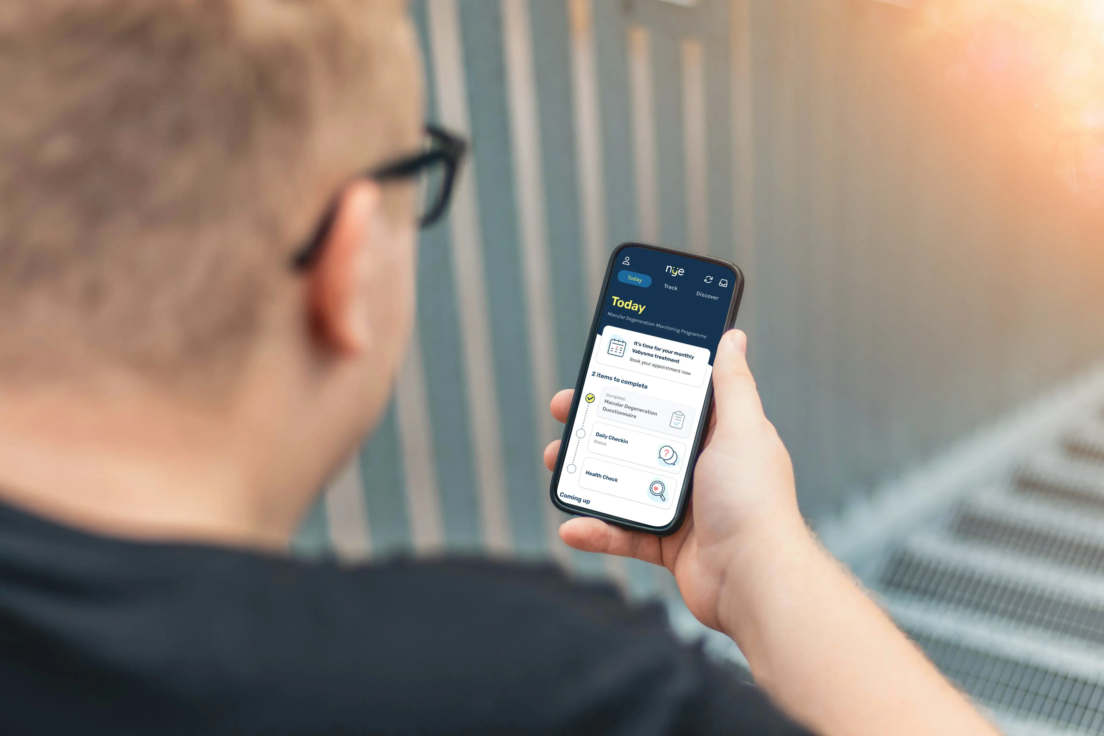
Nye is working to update the way people engage with healthcare. From tracking medications to recording long-term trends in symptoms, they’re re-examining the whole experience.
Nye has created a unique patient engagement and real-world data platform: a powerful, compliant bridge between patients, their data, healthcare providers and the life sciences industry. Fluent was brought in to help develop a prototype of how users might engage with that platform, along with a design system to keep future growth consistent.
Now, Nye can demonstrate the power of their platform’s capabilities in a user-friendly patient interface. Their extensive knowledge and expertise have been captured in a tangible, clinically viable proof of concept.
Adapting to the new face of digital healthcare
In today’s patient support landscape, new medications are trialled using a broader range of data sources. Nye’s platform would cover a cross-section of this landscape, including elements like the trend towards real-world evidence (RWE). RWE trials get data from select groups of patients, outside the confines of a clinical setting. It’s helping the pharmaceutical industry streamline delivery of new treatments, but it comes with its own challenges.
RWE participants can supply data physically by post. That can allow bigger cohorts than traditional clinical trials, but effective communication with all those patients is vital. The platform Nye was building would need to track a huge array of metrics. It had to be versatile and modular enough to work with, theoretically, any medical condition.
Fluent came on board in late 2022, with extensive experience in UX for the healthcare sector under our belts. With an understanding of Nye’s target markets, user groups, and use cases, it was time to define a product.
Discovery: Working with a strong tech legacy
Our discovery phase was aided considerably by Nye’s comprehensive market and user research. There was extensive documentation for us to dive into, letting us grasp the project even quicker than usual.
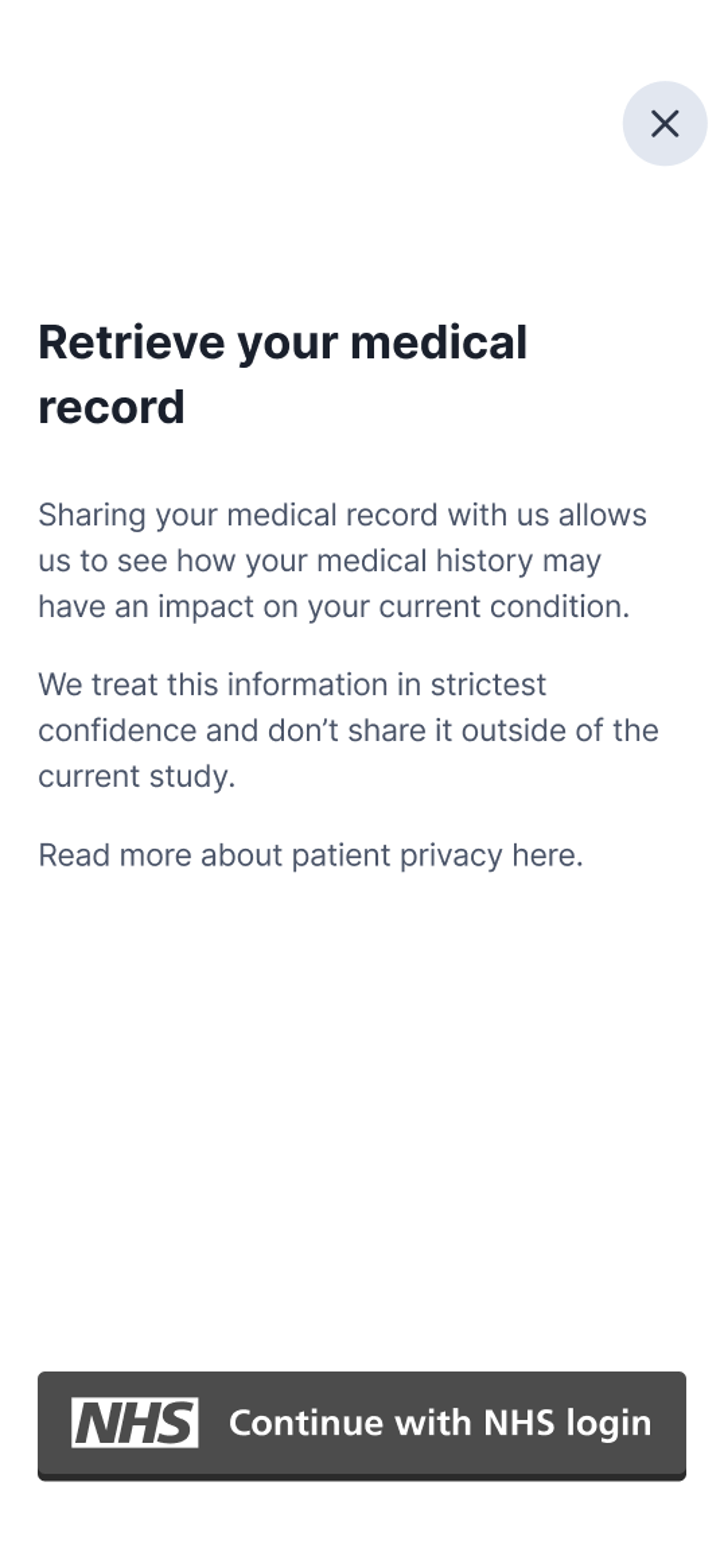
There were also pre-existing technical considerations to pick up. Nye already had the capability to integrate with NHS electronic health records. That was a defining advantage at this early product stage. Whatever technologies we used would need to maintain that integration.
Streamlining data access and permissions would clearly be a key element of the project, but there were also security considerations. Data had to be stored within particular jurisdictions and couldn’t be moved. That impacted the project’s architecture; some cloud services were ruled out, for example.
To begin with, we opted for the most straightforward solution which would leave the most room for scaling. A lot of focus was on low-friction ways for patients to give informed consent about access to their medical data.
A product design definition sprint gave us a series of concepts, potential capabilities for the finished app. Not long afterwards, after further reflection on what newer customers needed, came the design and development phase.
Defining a new journey for patients
A total of eight two-week sprints ran on an agile basis between January and April 2023. Ongoing customer research and internal discussion was giving us an increasingly clear picture of success. However, we needed to be able to adapt to new insights on the fly.
We knew we’d be gathering data from questionnaires, wearable devices, medical records, and similar sources. But the platform needed lots of flexibility in how it mixes those data sources together for any potential customer. This would allow it to be used in the required broad range of applications.
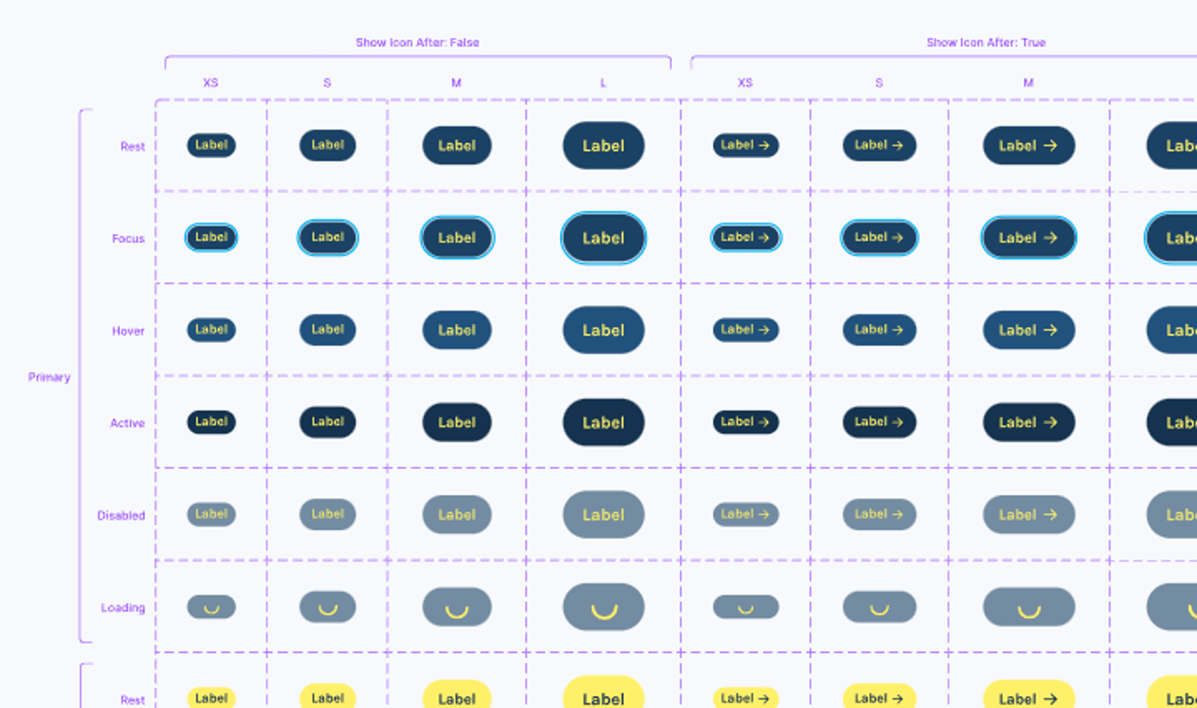
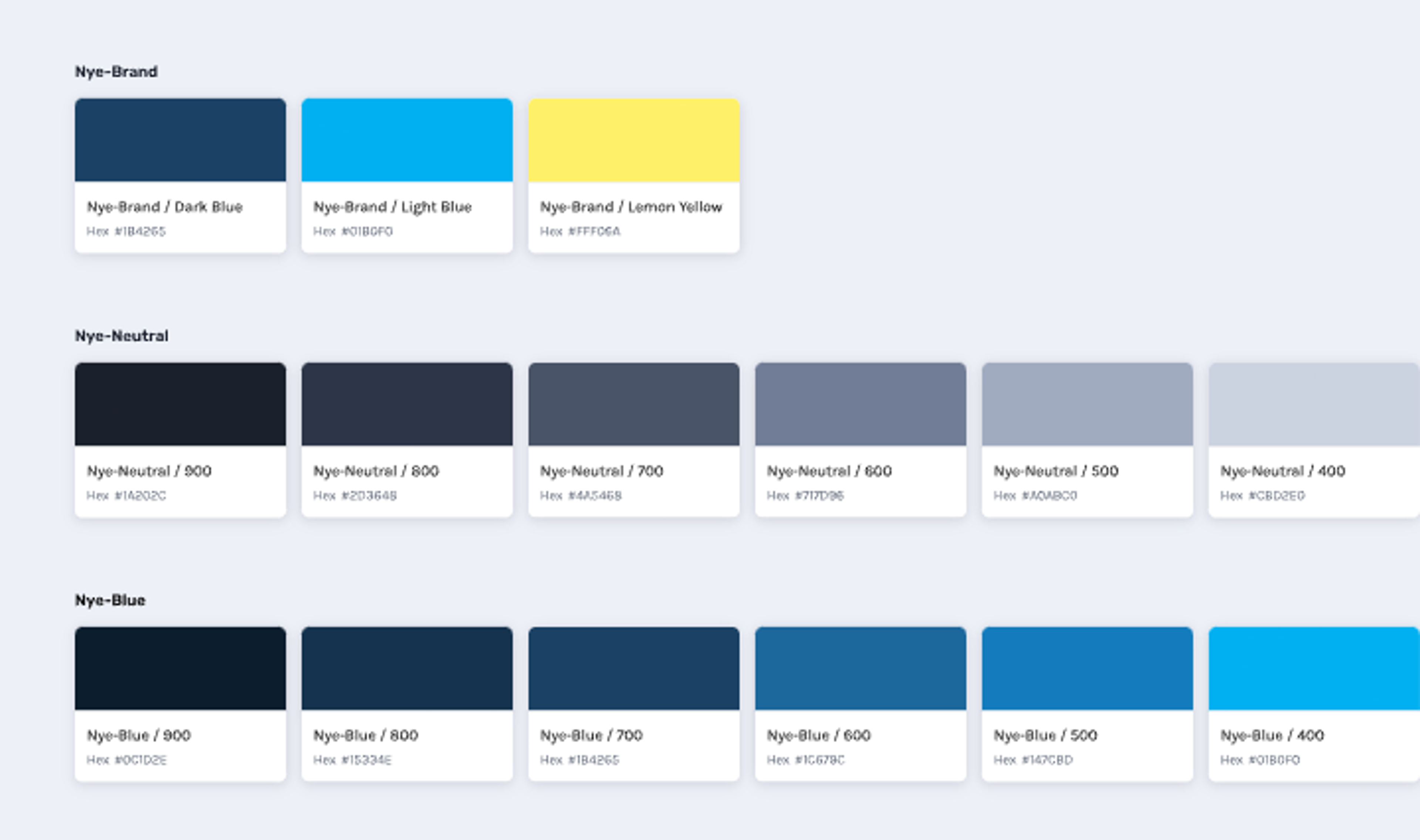
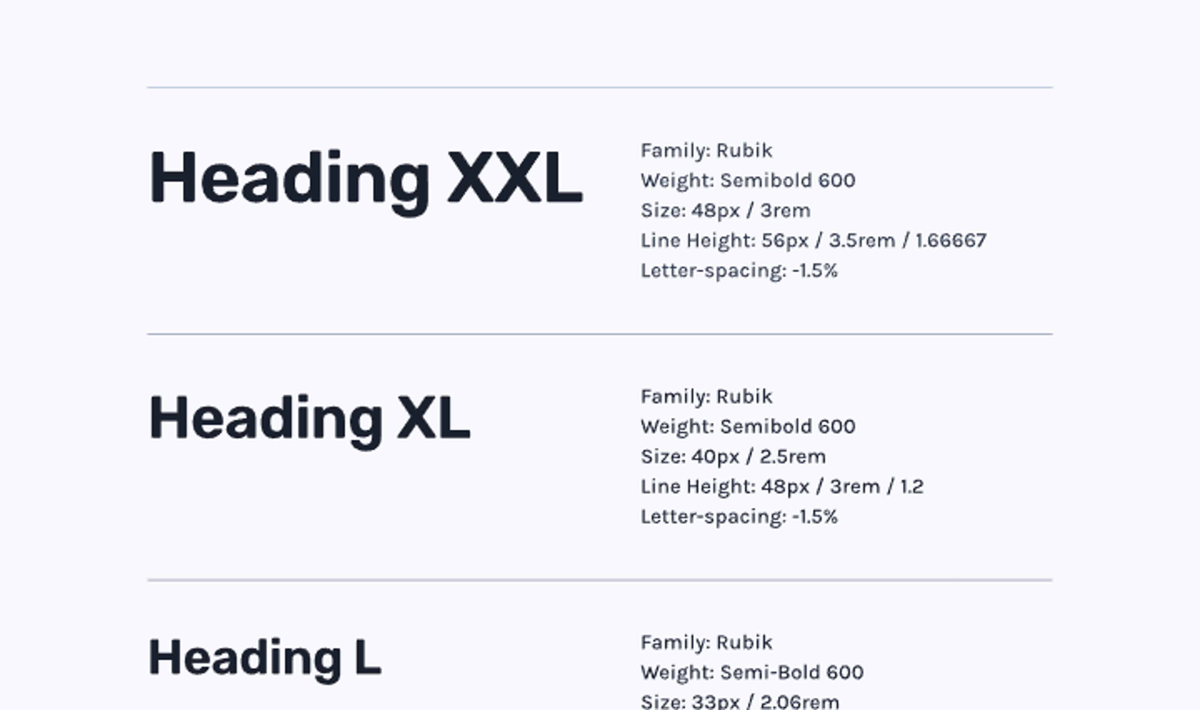
The decision was made to create a web-based proof of concept, something with the scope to be repurposed if needed. To help new content stay consistent, we also created a design system that Nye has taken on and developed further.
Towards the middle of the project, a lot of work was done to reconcile three distinct user journeys into this one branded experience. Participants in studies, Nye’s admin team, and prospective client companies actually running the tests each had to be accounted for.
As for the tech being used, Nye are big believers in using the very latest tools for the job. The platform’s front end used Remix and NextJS, but the majority of our work happened around the back. There, the Node back end used Prisma to talk to a Postgres database. A REST API written using a NestJS framework was particularly interesting to work with. It was similar to our own ASP.NET MVC framework in C#.

Result: A clearer picture of better health
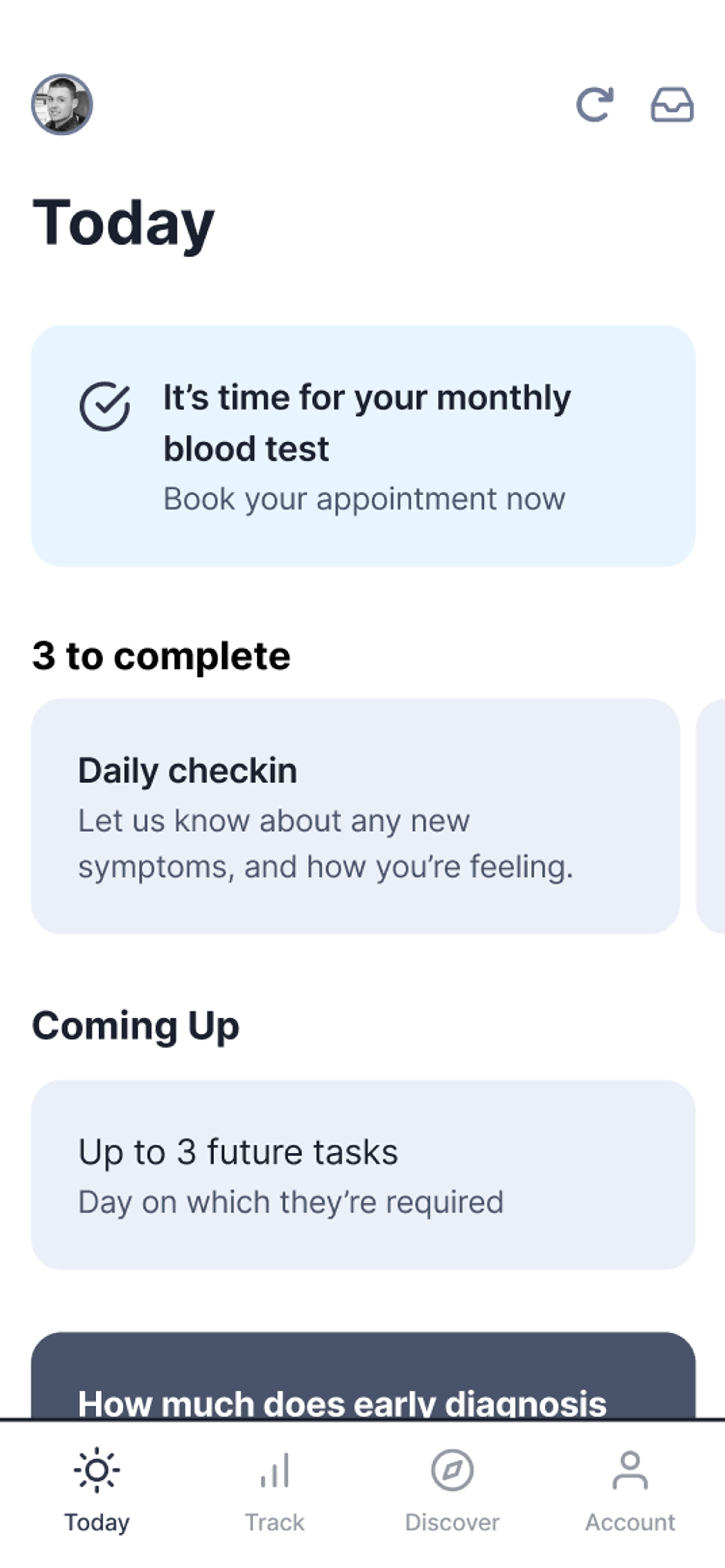
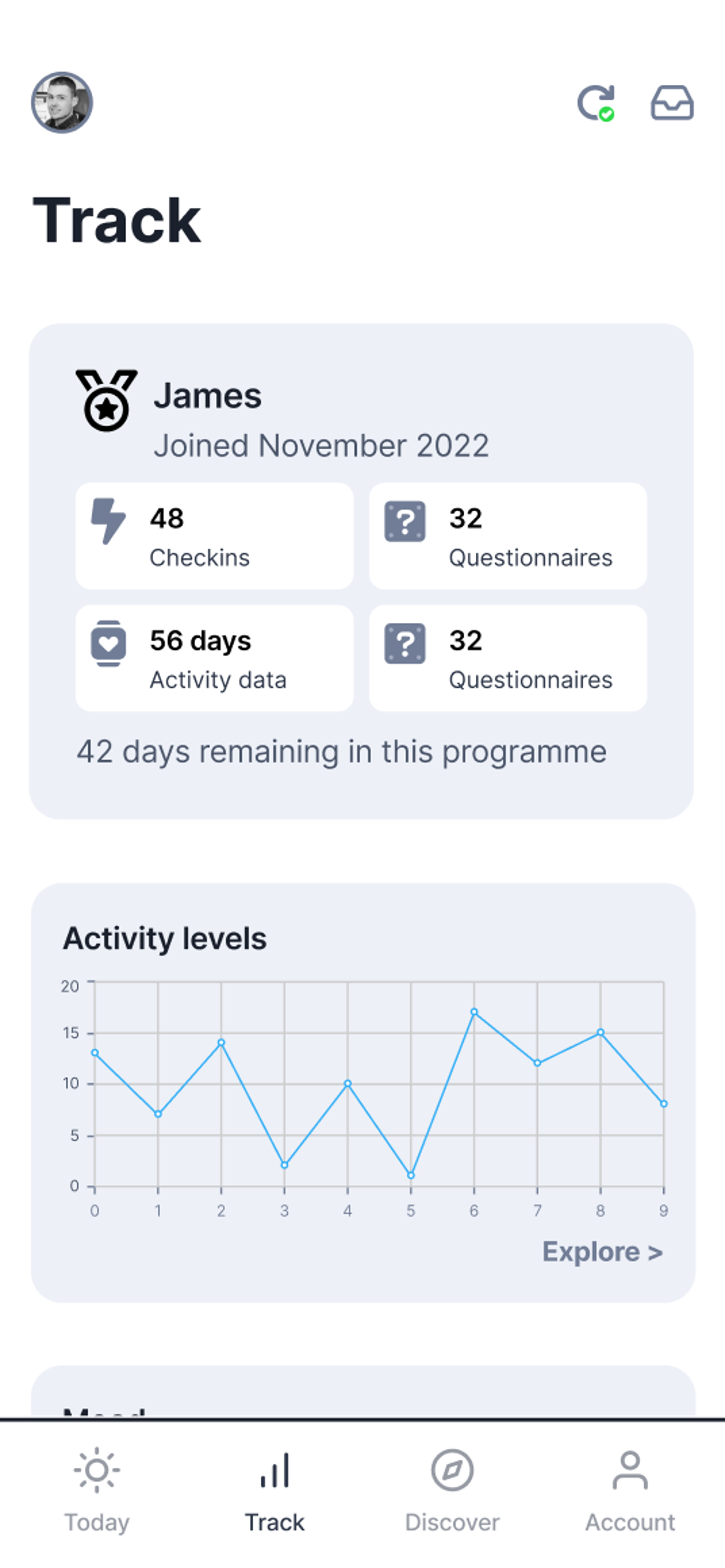
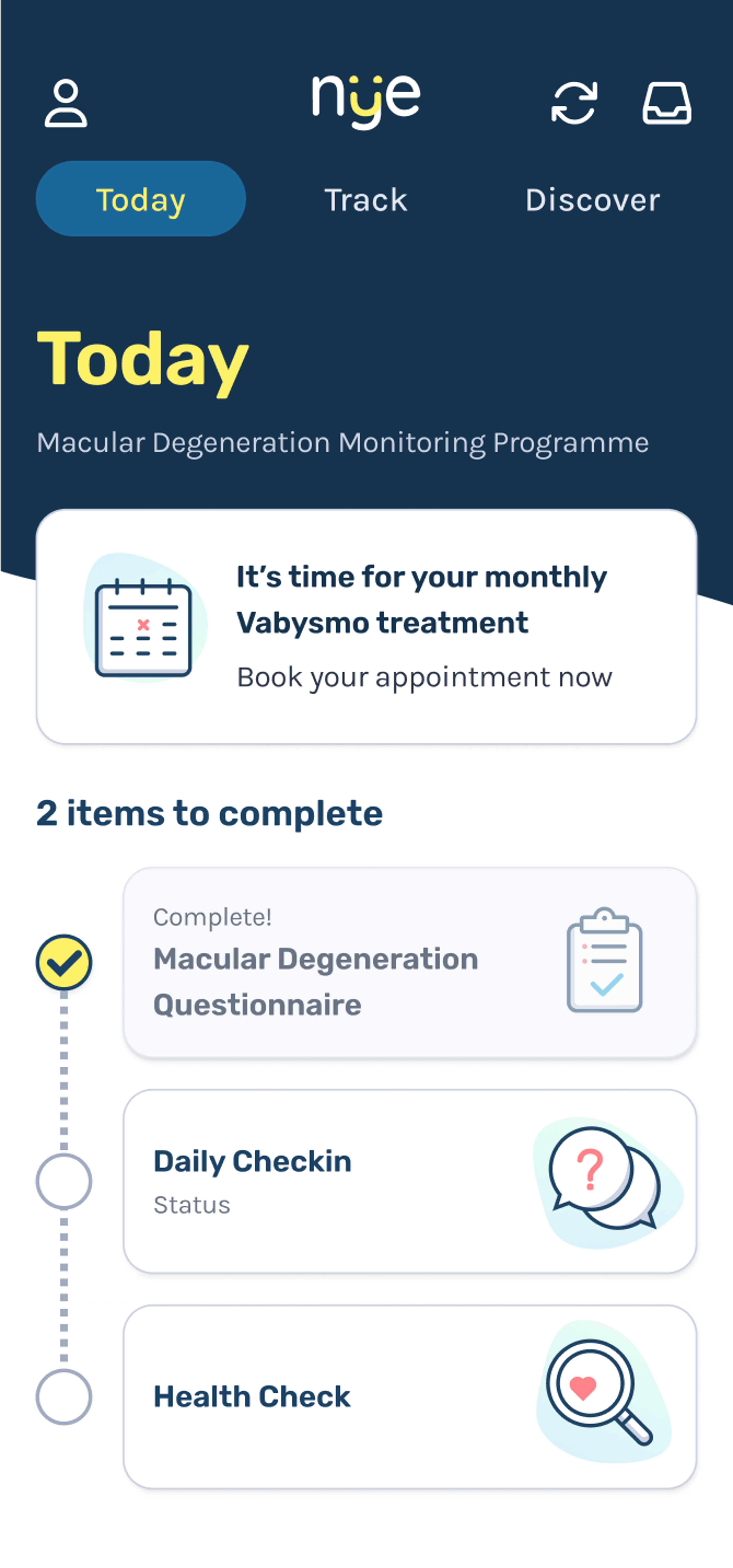
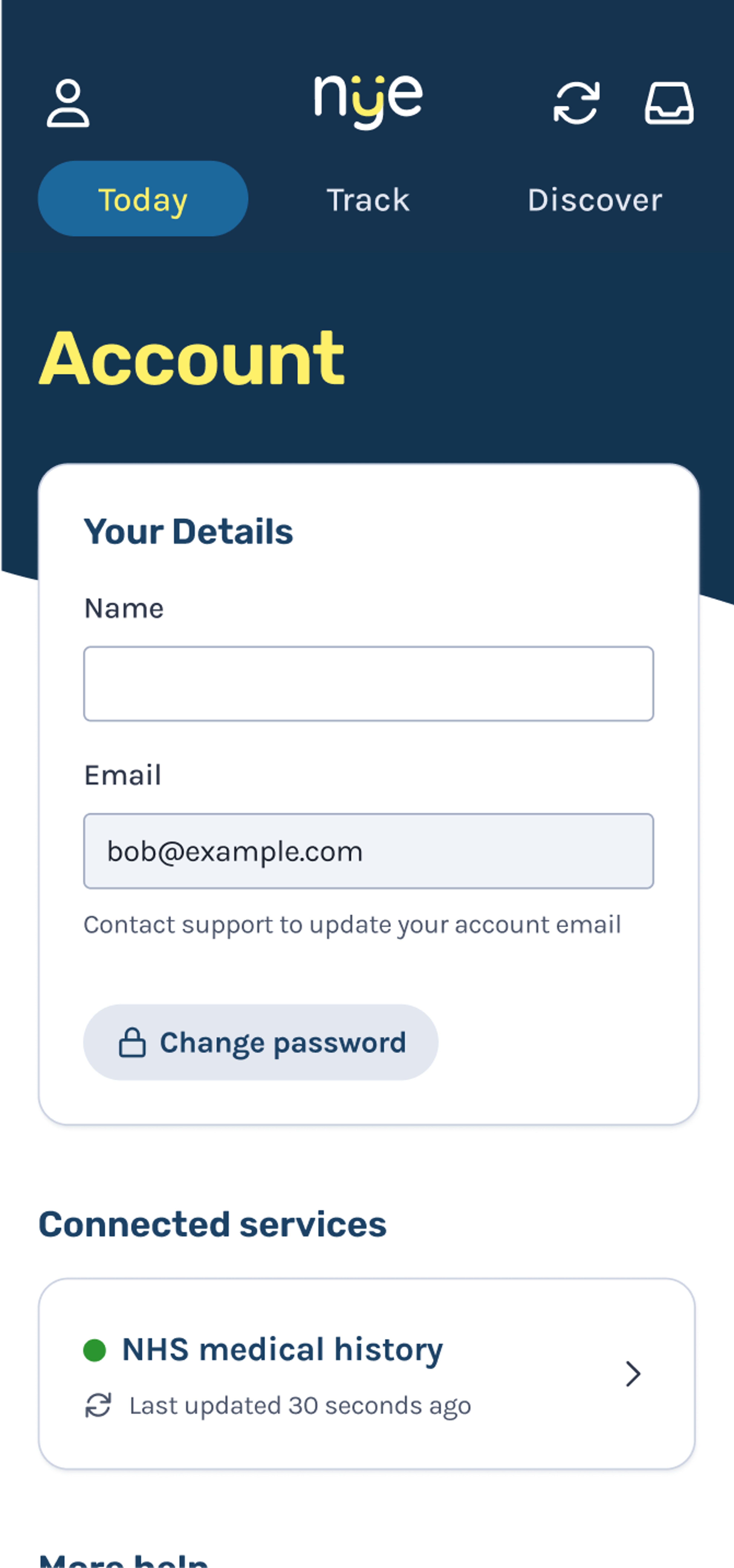
The finished proof of concept shows how patients can:
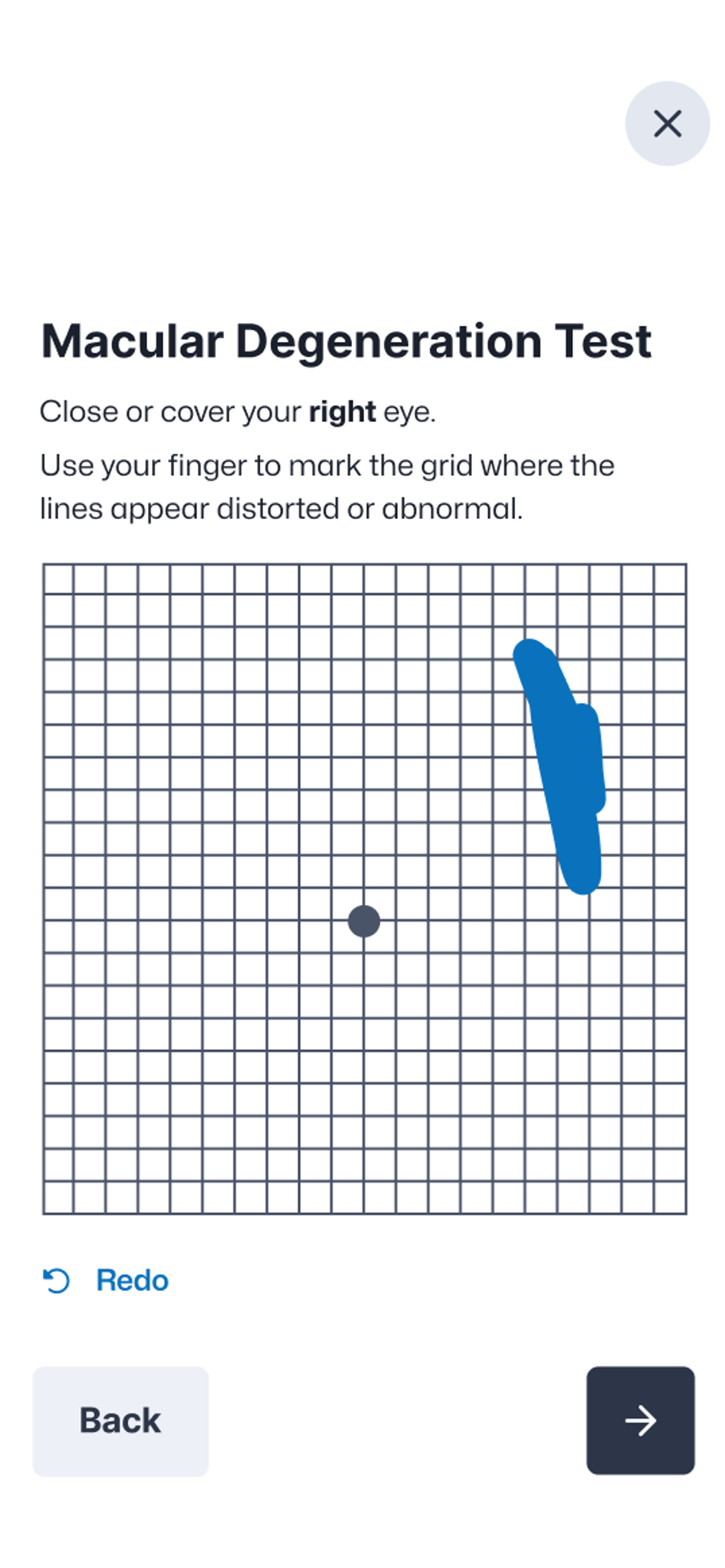
Complete health questionnaires
Track their symptoms
Record medication intake
Access resources specific to their condition
Meanwhile, we showed how those in charge of setting the surveys can easily create and assign them to individual participants. Before, Nye had a solid idea of what they could do to improve patient-doctor relationships. Now, they have the means to prove it, letting potential investors see the value for themselves.
Fluent are experts in distilling complex concepts into realised experiences like this. If you’ve got a project that can change the world, we’d love to help you build it. It only takes a conversation.
Fluent sits within the Cambridge Agency Group, working closely with a wider network of complementary digital specialists. Take a look at more work and case studies from across the group.
More from across the group

Talk to us about making a healthy difference
Got a digital healthcare challenge that calls for the Fluent touch?


