Psyomics
Censeo; an efficiency boost for the healthcare sector through clear mental health assessments

Psyomics helps NHS trusts, therapists and service users get a deeper understanding of mental health needs. Censeo, their digital mental health assessment platform, matches people to the most appropriate and effective treatment options.
Getting Censeo ready to deploy at scale demanded an intuitive user interface that could handle multiple formats and branching pathways. With Fluent’s wealth of experience in digital healthcare, they knew we could help.
Today, Psyomics are at the forefront of digital healthcare assessment. As demand for mental healthcare rises, Censeo is successfully guiding people towards the right support. Cases get triaged quickly and high-priority cases can be fast-tracked to clinical treatment.
Digital assessment comes of age
The 2020 pandemic forced the mental healthcare sector into realigning services and treatment. More people asking for help meant there simply aren’t enough qualified psychiatrists to provide full assessments. Instead, GPs use questionnaires to spot conditions like depression and anxiety, but these are decades old and relatively low-resolution.
In response, the product which would become Censeo grew from late-2010s studies at Cambridge University’s Centre for Neuropsychiatric Research. Trials involving over 5,000 people produced a branching analysis platform of more than 1,700 questions.
Capturing this deep process in an accessible user journey called for specialist expertise. Our track record with other digital healthcare clients like ieso and Oxford VR was all the proof Psyomics needed.

UX design guiding mental health therapy
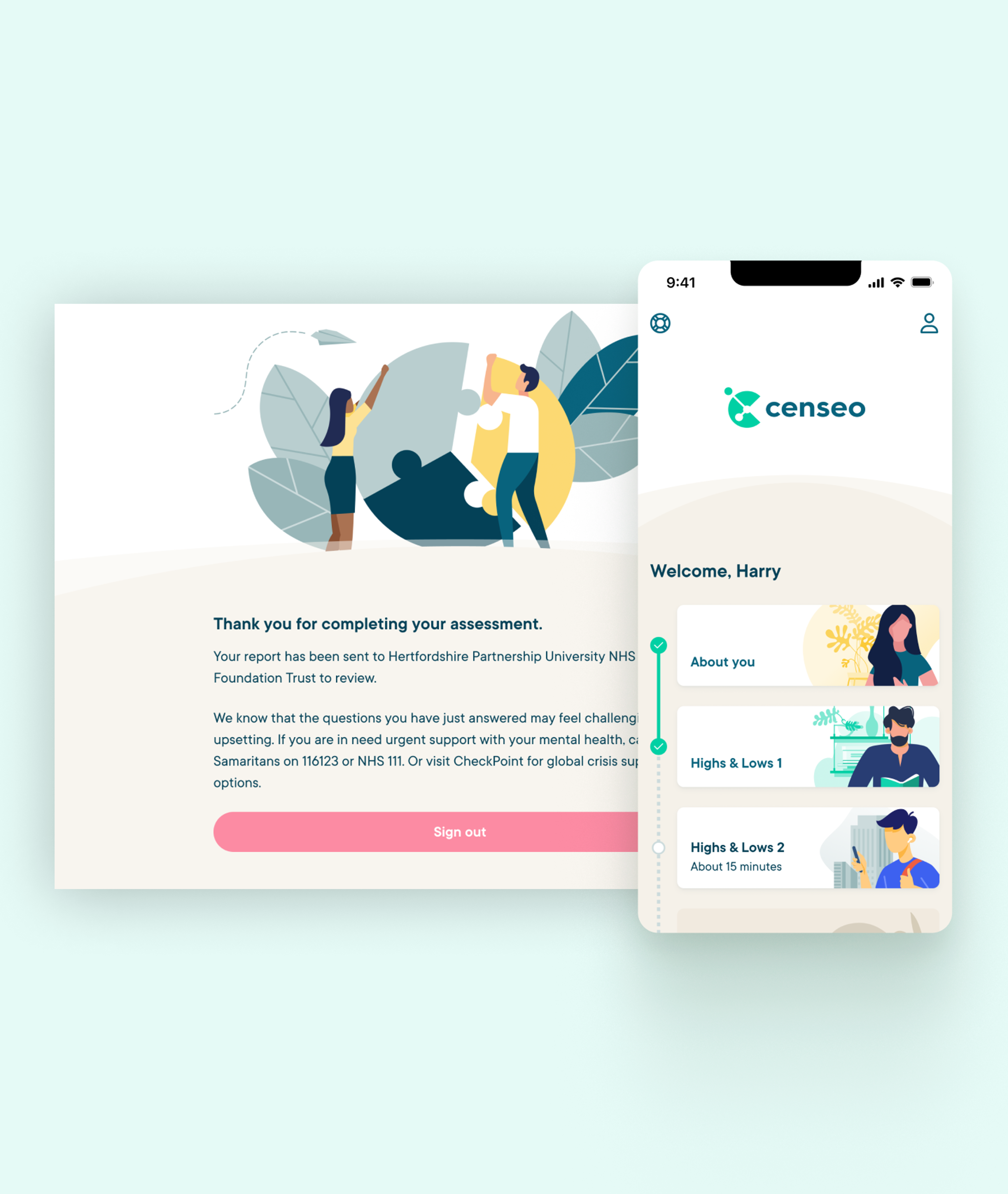
Psyomics had a strong understanding and foothold in their market. The NHS was one route with a lot of potential. But what about selling D2C or B2B via workplace health schemes? It was clear that the opportunities and reach for Censeo was vast, making the UX work for login and sign-up processes complex.
Each option involved accessing the service and delivering a assessment slightly differently. We also had integrations with other systems to think about. The NHS route, for example, needed Censeo to access NHS records and check eligibility for treatment.
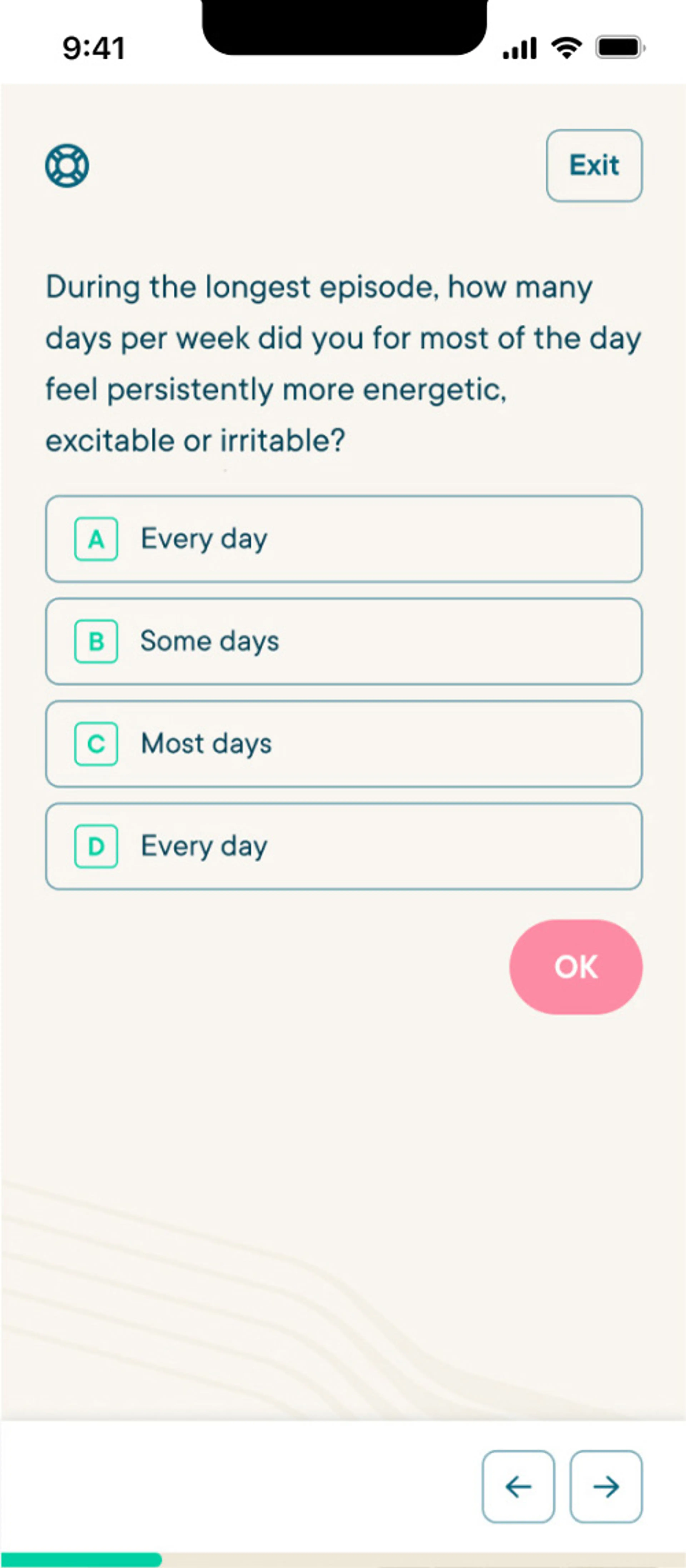
Designing for information triaging, evolving efficiencies
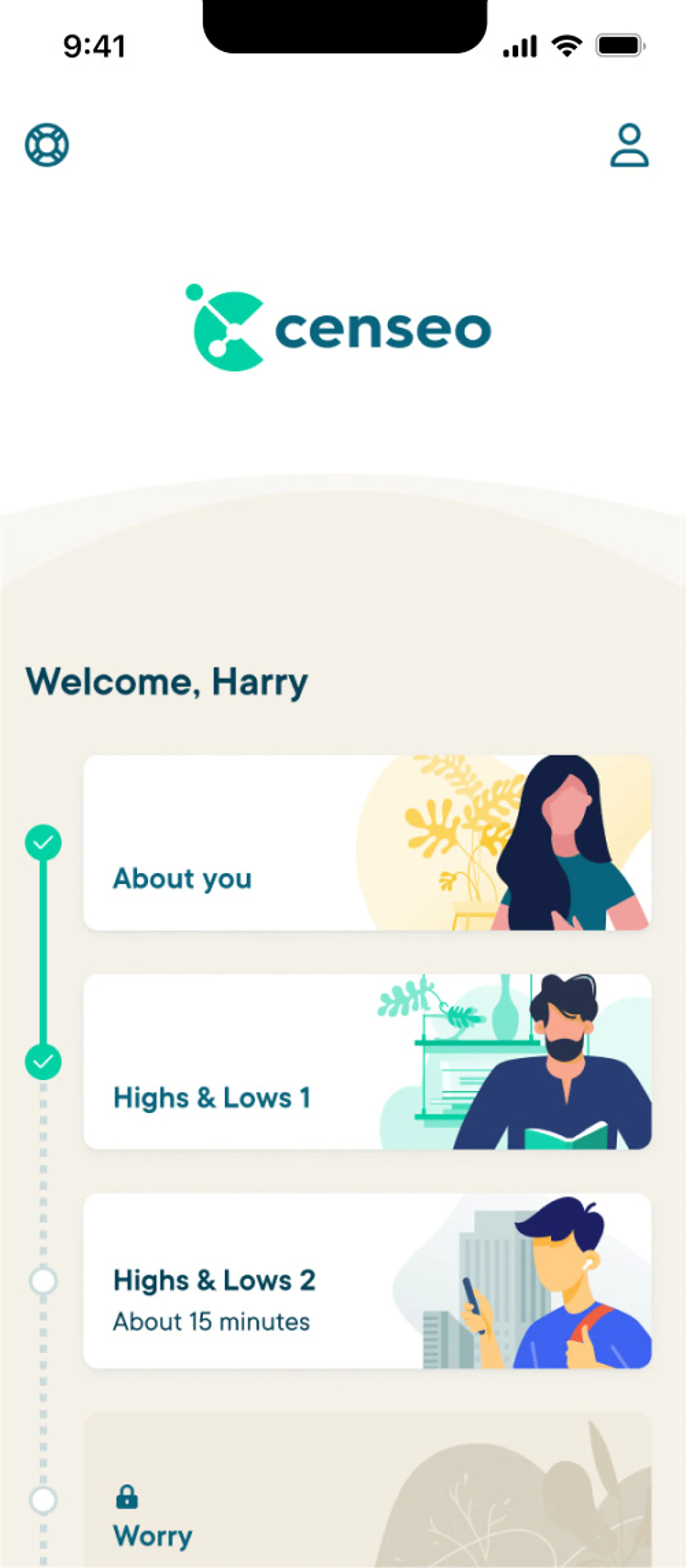
A typical user journey might potentially take someone through hundreds of questions, from a database of over 1,700. How could we help people pass from the start to the end points with as little friction as possible?
Things got more complex in that there were multiple possible formats for both capturing and reporting data. Some questions could be answered quantitatively. Others called for fuzzier degrees of truth, while others could only be addressed qualitatively by written answers. All these datasets had to work together.
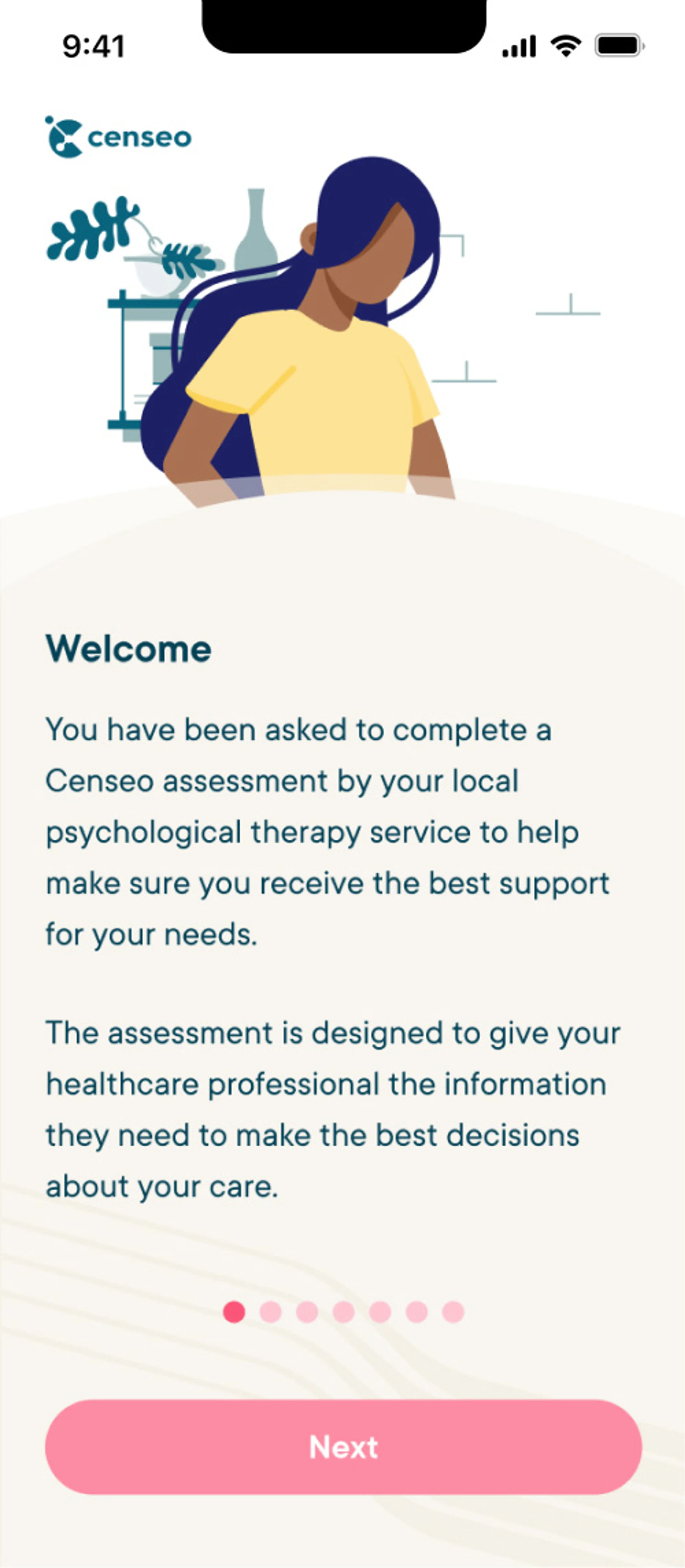
It was decided that questions would be broken up into sessions. Users’ answers to the first session would dictate the questions they saw in the next, and so on. Say early questions indicated the possibility of a condition like social anxiety, for instance, future questions would be tailored to zoom in on anxiety, providing the highest-resolution picture of a person’s mental health possible.
How these questions would be grouped formed the bulk of the UX work. But there were also shortcuts and improvements we could suggest to help people move through the process faster. A single-keypress answer feature is only one example, albeit a really helpful one for users. The balance was to streamline the assessment, while making sure each question retained the user’s full attention and focus.
Outcome: Putting care into action
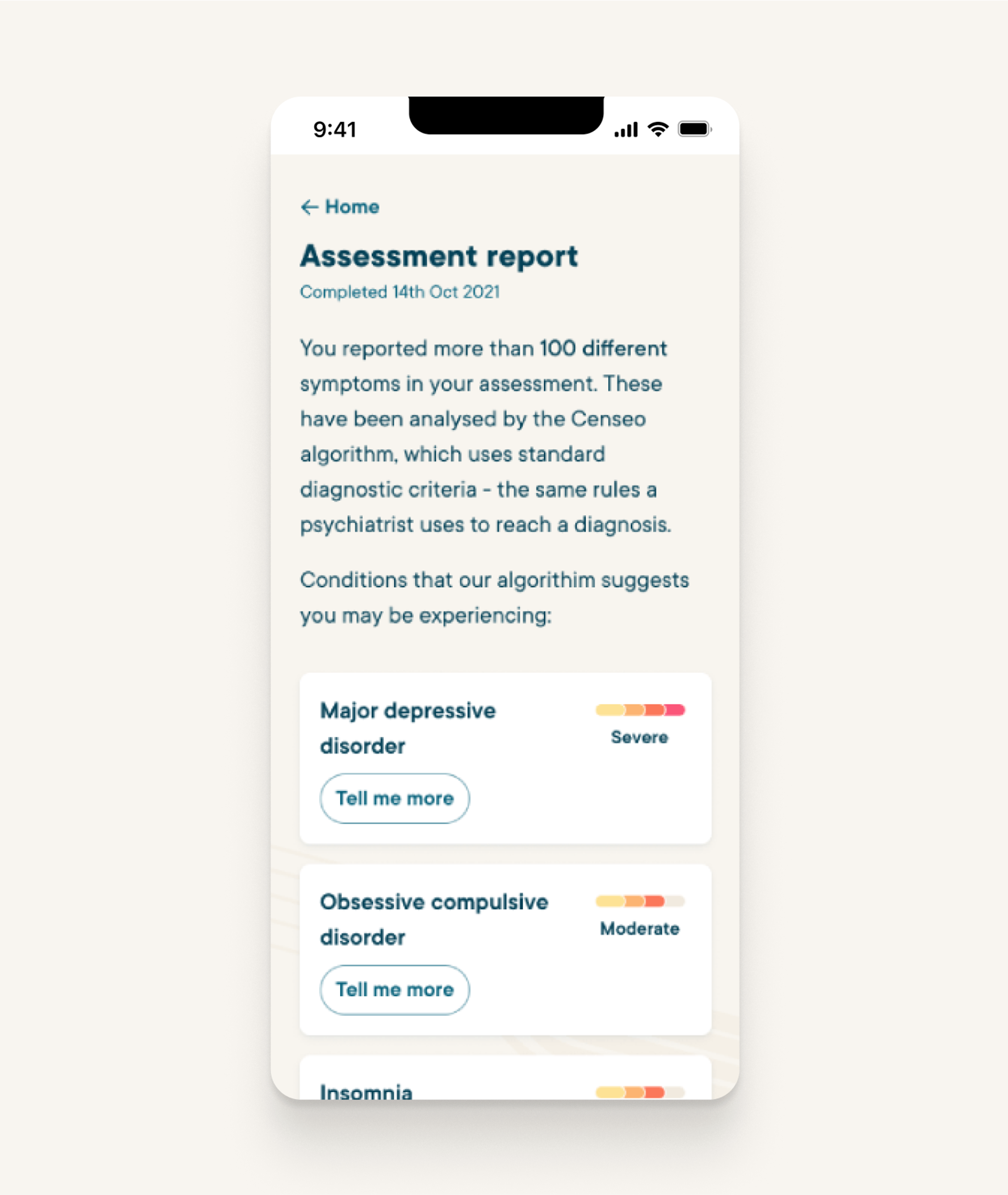
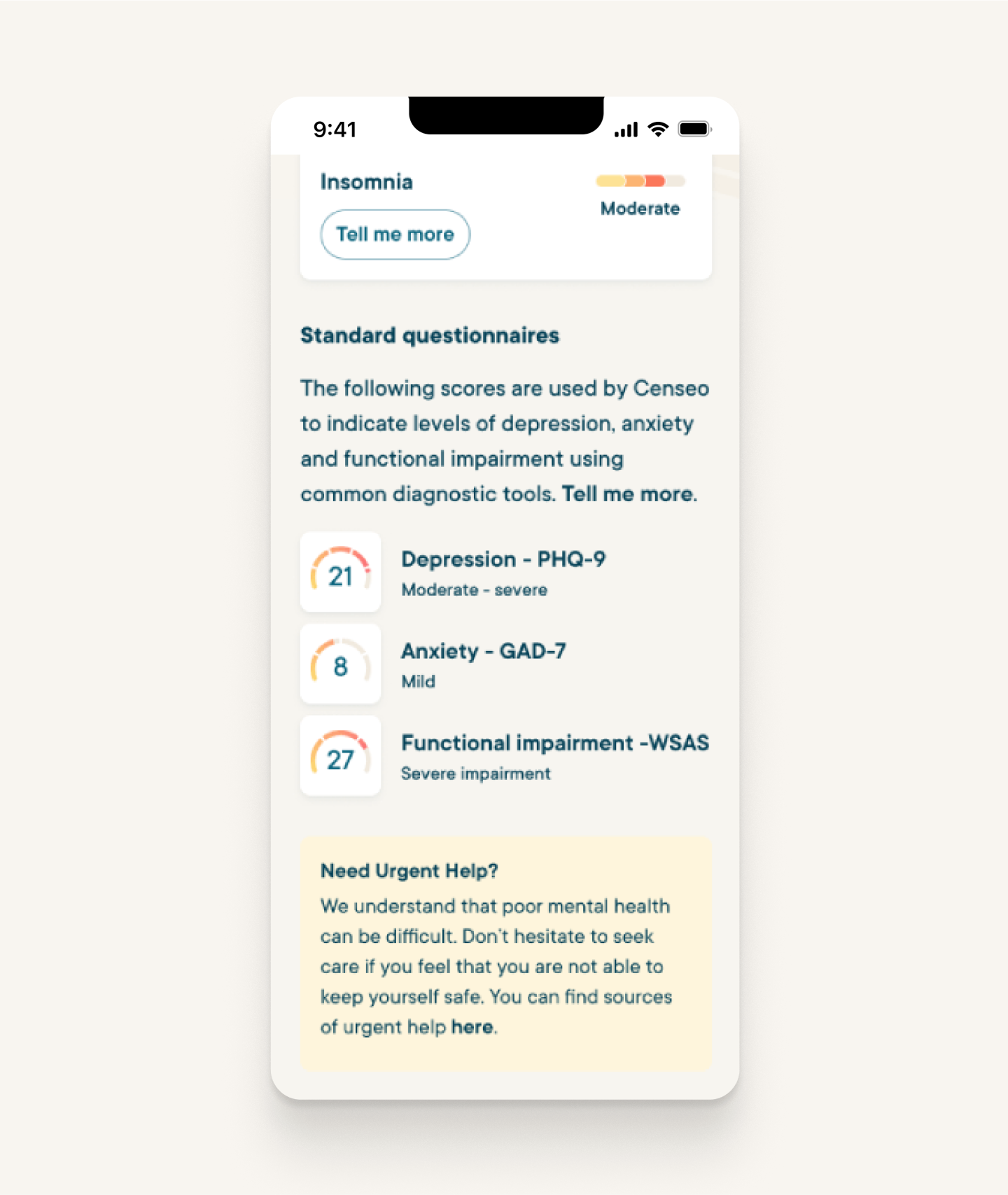
The finished platform gives mental health services a powerful triage tool. In late 2022, Hertfordshire Partnership University NHS Foundation Trust (HPFT) began a two-year partnership with Psyomics. Using Censeo, they’re dramatically shortening service users’ pathways to the right treatments.
At a time when healthcare is stretched to breaking point, tools like this offer a tangible means really make a difference. All it takes is a spark of inspiration, and a deep knowledge of how digital healthcare products get used.
Fluent sits within the Cambridge Agency Group, working closely with a wider network of complementary digital specialists. Take a look at more work and case studies from across the group.
More from across the group

Talk to us about making a healthy difference
Got a digital healthcare challenge that calls for the Fluent touch?


